

Work

About me

Design process

Resume
DH

Improving new feature visibility


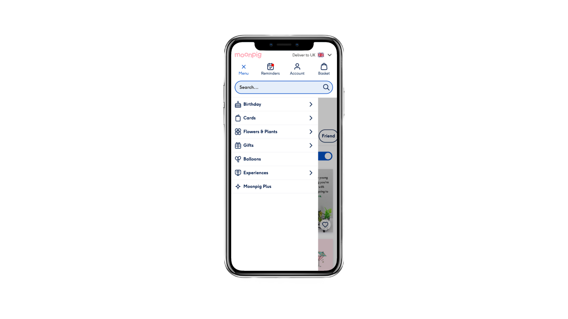
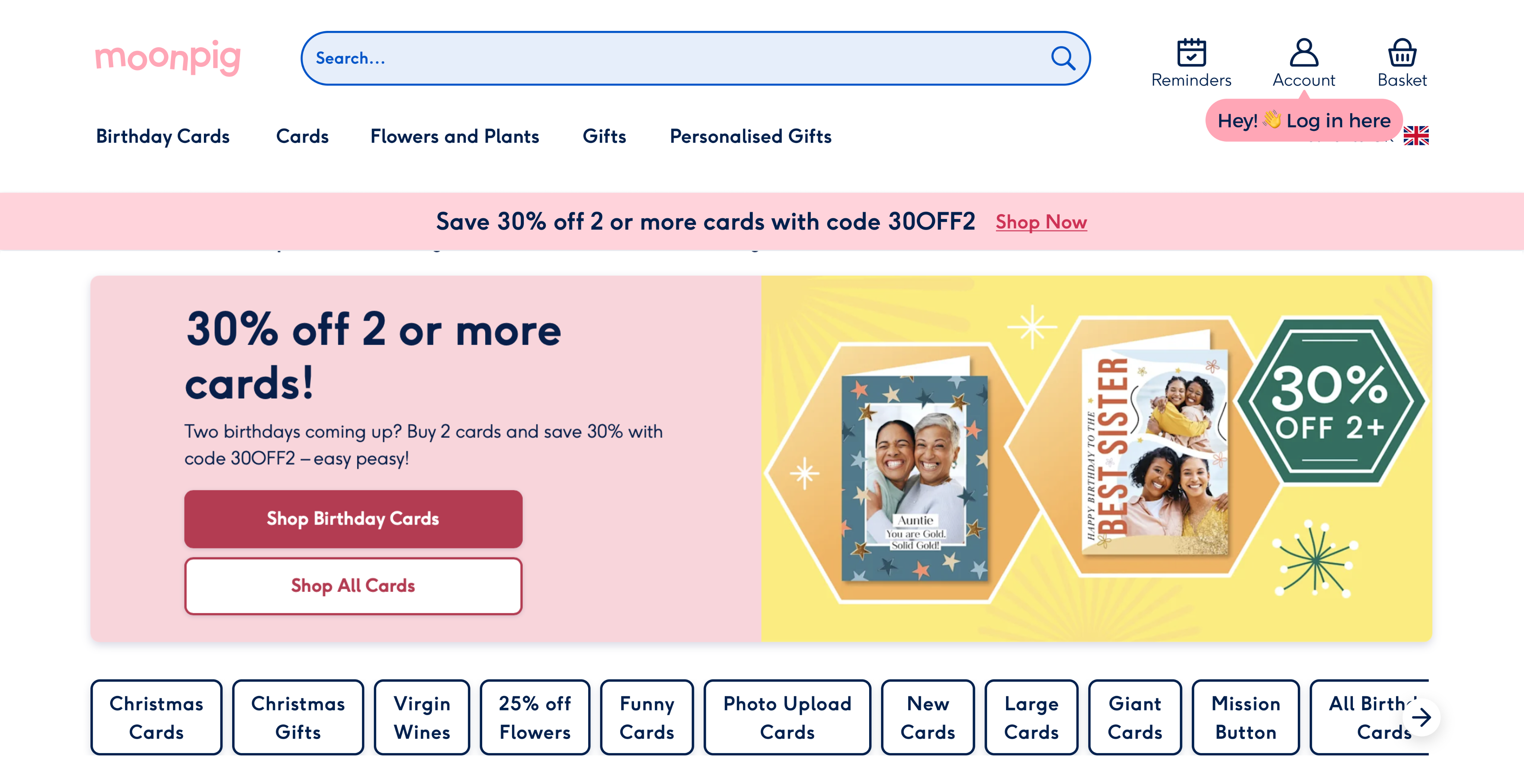
Group cards is ‘hidden’ in the meganav, making it difficult for users to find it.
“Oh wow this is such a fantastic idea! I had no clue Moonpig offered a service like this, sounds much easier than passing a colleague’s birthday card around the office.” - 36, F, Moonpig customer
Existing research

A survey of 1.9k respondents revealed that the most popular occasions for group cards are colleagues (birthday, leaving, or starting a new job) and birthdays. In previous card sort of over 15 features, we found that group cards were one of the most exciting features for both customers and non-customers.

Users need a visual aide coupled with simple copy to understand the proposition of group cards.

Most group cards are started and completed on desktop, likely because the most popular occasions—colleagues leaving or starting a new job—occur at work.
IDEATION


Mobile: card modal tab

Mobile: interstitial page
Final design


The interstitial design would take over 100 weeks for specific occasions and 20-30 weeks for all occasions. Therefore, we chose the modal design for all occasions for a more adequate time to reach significance.

Home
More to explore...
Menu iconography

0.4% increase in conversion
Log in incentive

0.2% decrease in conversion
Want to collaborate?

Let’s talk

Send an email


Work
About me
Design process
Resume
DH
Improving new feature visibility
Group cards is ‘hidden’ in the meganav, making it difficult for users to find it.
“Oh wow this is such a fantastic idea! I had no clue Moonpig offered a service like this, sounds much easier than passing a colleague’s birthday card around the office.” - 36, F, Moonpig customer
Existing research
A survey of 1.9k respondents revealed that the most popular occasions for group cards are colleagues (birthday, leaving, or starting a new job) and birthdays. In previous card sort of over 15 features, we found that group cards were one of the most exciting features for both customers and non-customers.
Users need a visual aide coupled with simple copy to understand the proposition of group cards.
Most group cards are started and completed on desktop, likely because the most popular occasions—colleagues leaving or starting a new job—occur at work.
01
02
03
04
IDEATION
7 users • age 18-65 • customers & non-customers
Platform: usertesting.comTask: Find a card for a colleague who’s leaving the company
Mobile: card modal tab

Desktop: card modal tab
Mobile: interstitial page
7 users • age 18-65 • customers & non-customers
Platform: usertesting.comTask: Find a card for a colleague who’s leaving the company
Final design
The interstitial design would take over 100 weeks for specific occasions and 20-30 weeks for all occasions. Therefore, we chose the modal design for all occasions for a more adequate time to reach significance.
Home
More to explore...
Menu iconography
0.4% increase in conversion
Log in incentive
0.2% decrease in conversion
Want to collaborate?

Let’s talk
Send an email
D
H
Improving new feature visibility
Problem
Group cards is one of Moonpig’s most exciting features, yet it accounts for 0.2% of total orders. Users struggle to discover it organically, highlighting a clear visibility issue in the core journey.
Outcome
Added group cards to the card modal—a key step in the user flow—making it easier to find. This led to a 0.64% increase in group card project creations and a 1.4% lift in conversion.
Group cards is ‘hidden’ in the meganav, making it difficult for users to find it.
“Oh wow this is such a fantastic idea! I had no clue Moonpig offered a service like this, sounds much easier than passing a colleague’s birthday card around the office.” - 36, F, Moonpig customer
Existing research
A survey of 1.9k respondents revealed that the most popular occasions for group cards are colleagues (birthday, leaving, or starting a new job) and birthdays. In previous card sort of over 15 features, we found that group cards were one of the most exciting features for both customers and non-customers.
Users need a visual aide coupled with simple copy to understand the proposition of group cards.
Most group cards are started and completed on desktop, likely because the most popular occasions—colleagues leaving or starting a new job—occur at work.
01
02
03
04
IDEATION
Sketches
initial ideation
With a packed roadmap and Valentine's Day approaching (A/B testing isn't allowed during peak holidays), we needed to act fast. We tackled the problem from two angles: discovery and findability. I facilitated a 1-hour ideation session with six engineers and other stakeholders (marketing, analysts, etc.). We dot voted and selected the top three ideas.
7 users • age 18-65 • customers & non-customers
Platform: usertesting.comTask: Find a card for a colleague who’s leaving the company
Mobile: card modal tab
Desktop: card modal tab
Mobile: interstitial page
7 users • age 18-65 • customers & non-customers
Platform: usertesting.comTask: Find a card for a colleague who’s leaving the company
Final design
A/B testing duration
dependent on targeted occasions
While I iterated the designs based on user feedback, I spoke to our product analyst to get time estimates for each design (modal & interstitial page) in order to reach significance. Depending on the occasions we targeted, we had two options:
The interstitial design would take over 100 weeks for specific occasions and 20-30 weeks for all occasions. Therefore, we chose the modal design for all occasions for a more adequate time to reach significance.
Home
More to explore...
Menu iconography
0.4% increase in conversion
Log in incentive
0.2% decrease in conversion
Want to collaborate?
Let’s talk
Send an email
Links
Work
About me
Design process
Download resume