

Work

About me

Design process

Resume
DH

Menu bespoke icons, uplift in conversion
Mobile menu bespoke icons
Use visual elements to help users find what they need quicker in mobile menu
One of the biggest challenges for users is finding the perfect card or gift for their recipient(s). This process takes the longest and is where we see the highest drop-off in the user journey.
To address this, we began researching ways to help users find what they need more quickly. We decided to break this larger problem into smaller, manageable parts. Based on this, we started with the mobile menu, as it requires minimal engineering effort and can be A/B tested within 2-3 weeks.
Problem
Users struggle to find the perfect card or gift—resulting in the highest drop-off point in the user journey.
Outcome
Designed bespoke icons to improve menu clarity and speed up navigation—resulting in a 0.44% uplift in conversion and 10% reduction in time to select category.
Role
Product Designer
Timeline
Oct 2023 — Nov 2023
Team
1 midweight designer (me), 1 product manager, team of developers
Tools
Figma
Miro
Usertesting.com
Hotjar
JIRA
Slack
Google suite
Role
Product Designer
Timeline
Dec 2023 — Mar 2024
Team
1 midweight designer (me), 1 principal designer, 1 product manager, 1 delivery manager, team of developers
Tools
Figma
Miro
Usertesting.com
Hotjar
JIRA
Slack
Google suite
DISCOVER
Competitor analysis
explore visual elements in menus
Researched direct and indirect competitors to identify existing patterns and opportunities for ideation.
Adidas: Emojis
Low effort:
Easy to implement, no design effort
Pros:
Familiar, are easily recognised, could be fun?
Cons:
Does not align with brand, looks a bit cheap?
Edge cases:
Difficult to find emojis that represent certain categories
Hallmark: icons
Mid-low effort:
Easy to implement, medium design effort
Pros:
Clean, easy to scan, aligns with branding tone
Cons:
Could be ambiguous, e.g. hiring icon in dribbble
Edge cases: Niche categories can be difficult to create icon
IKEA: product images
Mid effort:
High quality & consistent product images needed
Pros:
Realistic representation of products, could be used to inspire users
Cons:
Products of different shapes/sizes, could look messy
Edge cases:
When adapting menu categories, images must remain consistent
Other: personalised menu
High effort:
A lot of engineering effort, mid design effort
Pros:
Can help inspire users, prioritise most visited categories
Cons:
Requires users to be logged in, algorithm be ‘wrong’
Edge cases:
Difficult to balance overrides for peak occasions
DEFINE
Define key metrics
measure impact
01
Reduce time to select mobile mnu category by 15%
Reducing time spent looking for a category improves the user experience, driving engagement and reducing drop-offs.
02
Decrease mobile menu drop-off rate by 10bps
While the change is small, improving clarity in the mobile menu can reduce early friction.
03
Increase conversion by 30bps
A 30bps conversion uplift at this stage drives meaningful revenue at scale, showing that clearer navigation helps users complete their journey.
IDEATION
Ideas mapped based
on effort, user benefit & feasibility
To prioritise the top ideas, I created a matrix to evaluate effort, user benefit and feasibility per idea. User benefit criteria was based on the following:
- Improves findability & navigation
- Enhances the browsing experience
- Aligns with user expectations
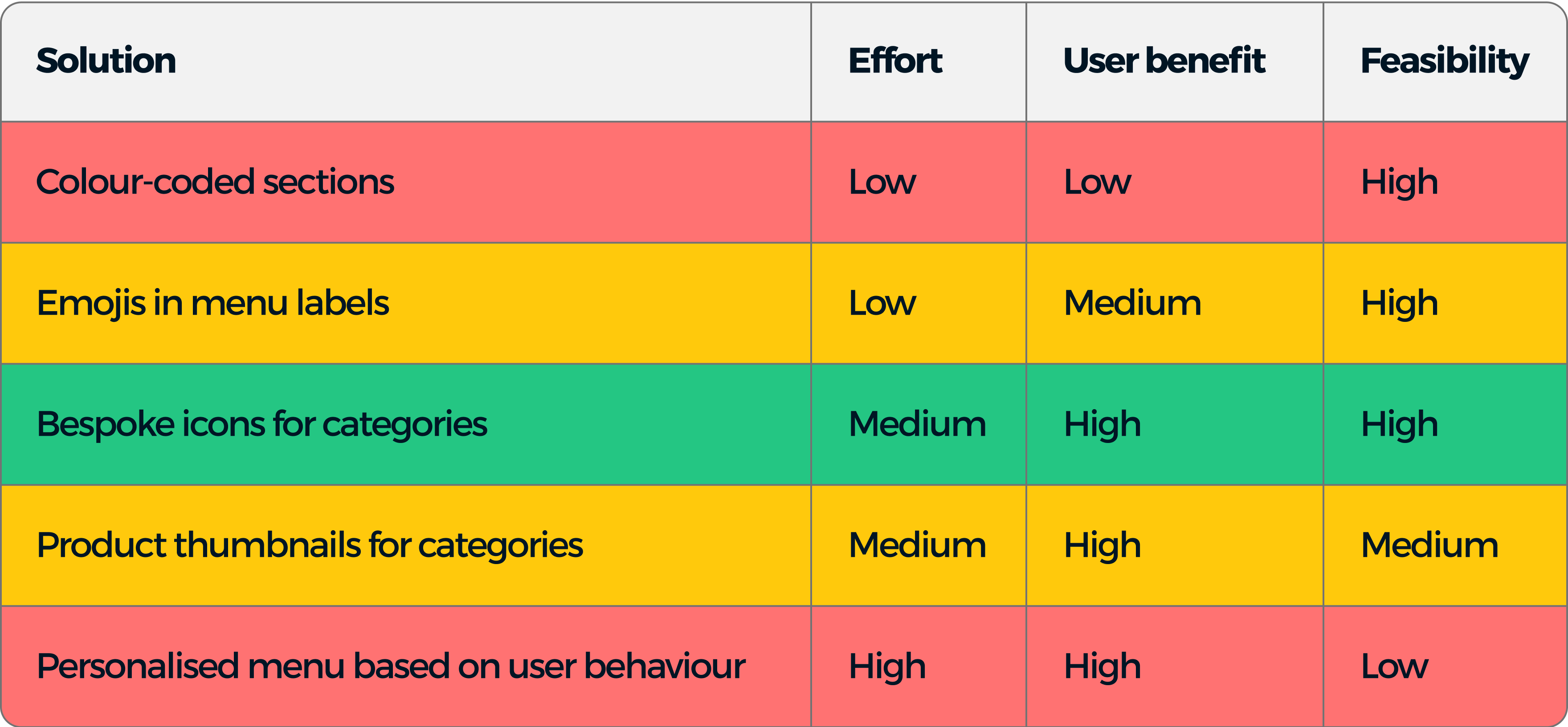
Based on the criteria, we chose bespoke icons for categories as the optimal solution to improve findability in the mobile menu due to the following reasons:
- Scannability: Icons enhance visual scanning, allowing users to quickly identify categories.
- Cognitive load reduction: Recognisable icons simplify navigation and decision-making.
- Brand alignment: Icons reinforce our brand identity and visual language.
- User expectations: Icons meet user familiarity in mobile interfaces.
- Ease of implementation: This solution can be implemented quickly with minimal engineering effort.
Once we decided on this, I complied a list of icons needed for all menu categories.
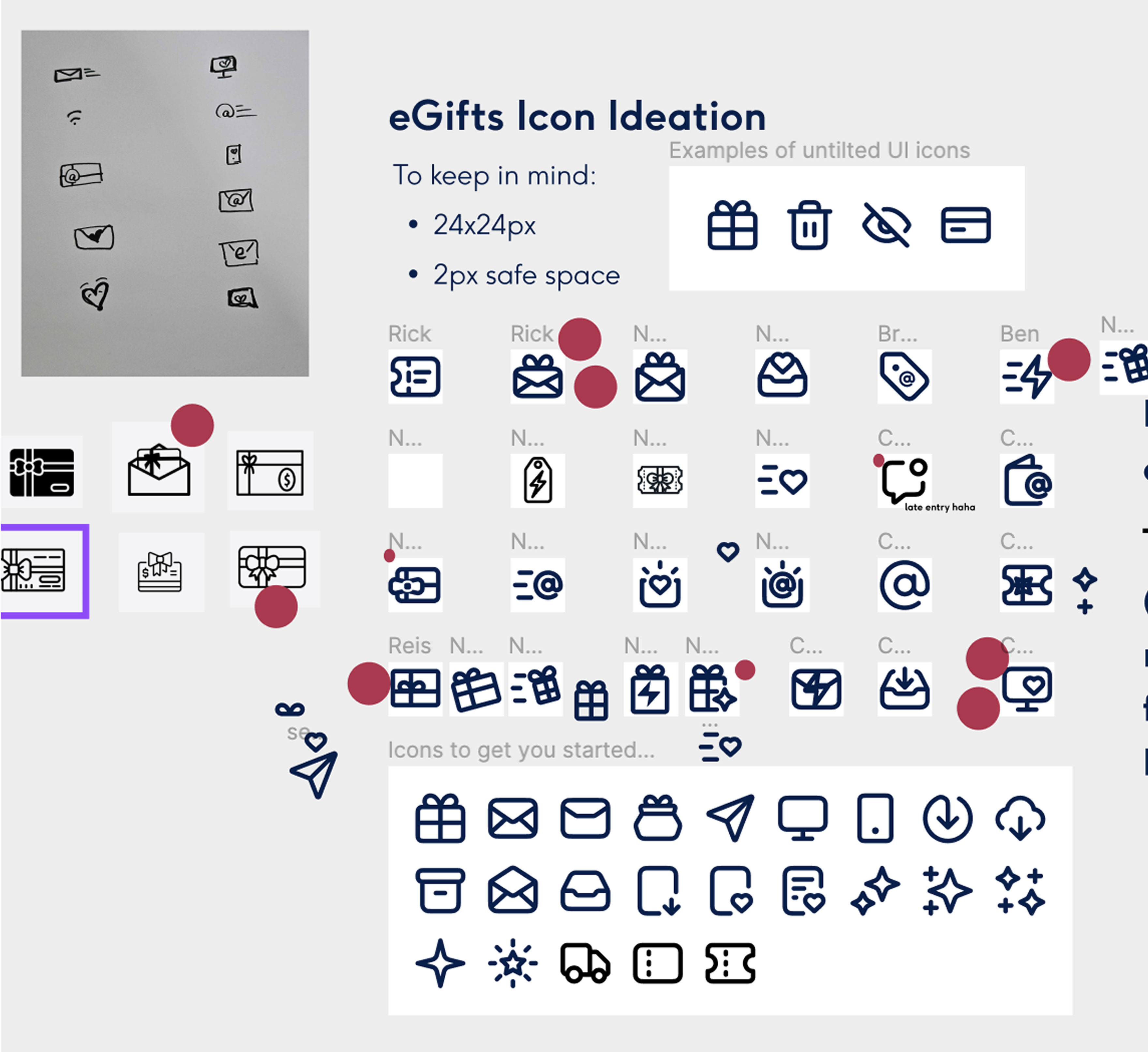
Ideation workshop
sketches & hi-fi
I gathered a few designers to ideate for the most complex icon (eGifts). I decided to focus on that icon to have an anchor for the rest of the icons. At the end, we dot voted on the top icons.
FINAL DESIGN
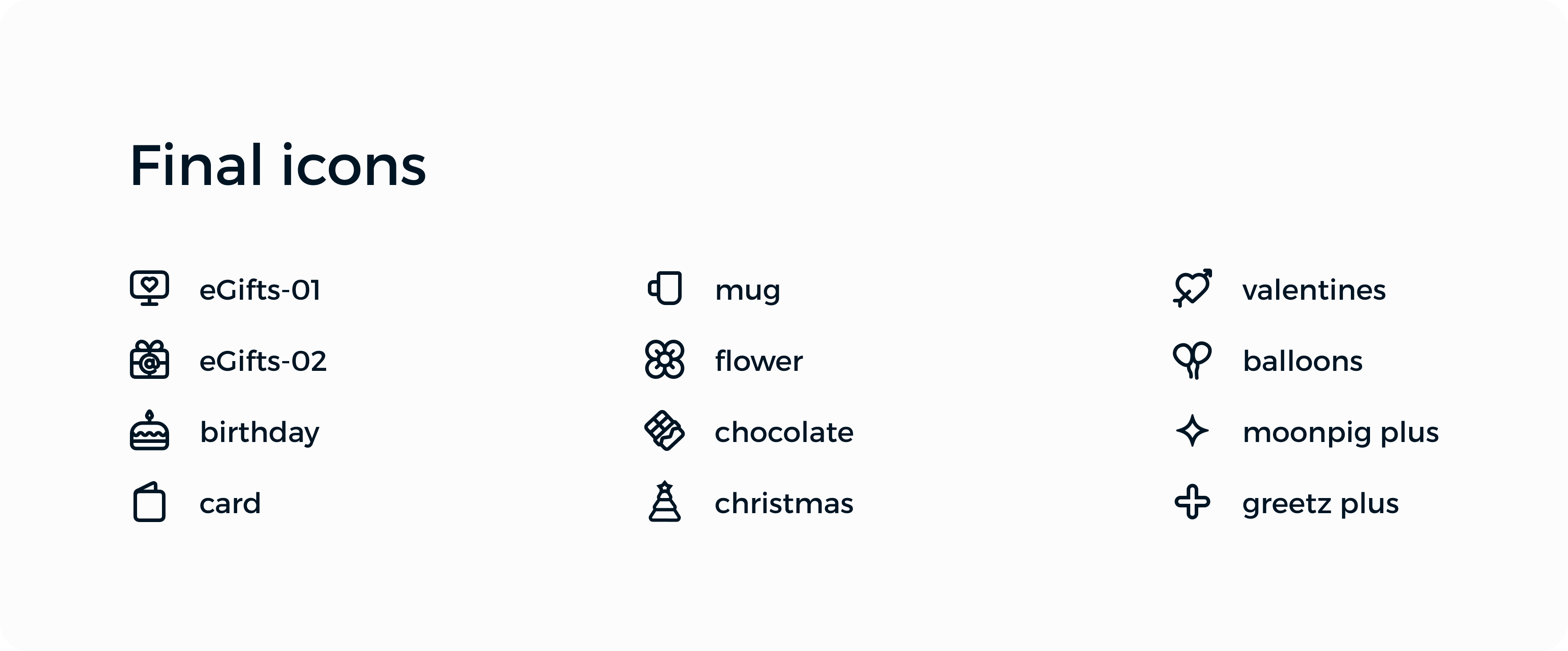
12 icons to
enhance menu clarity
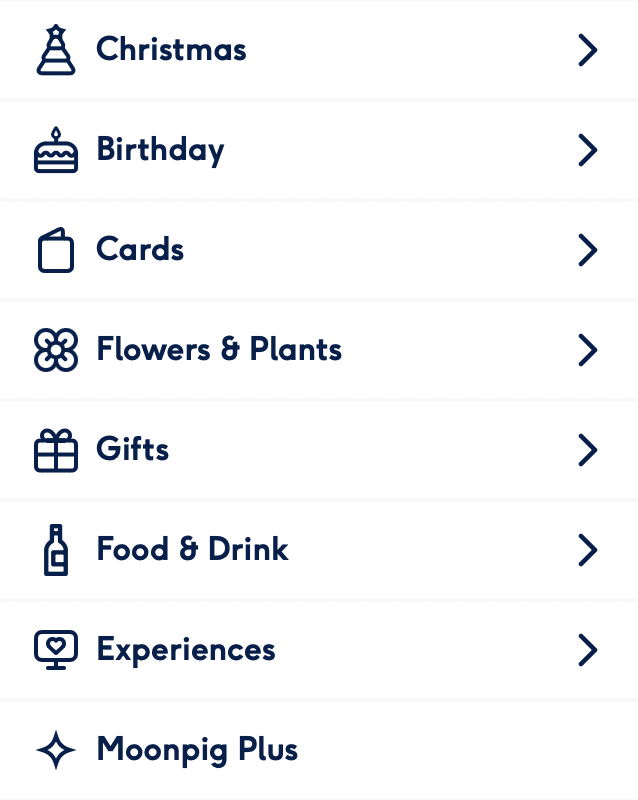
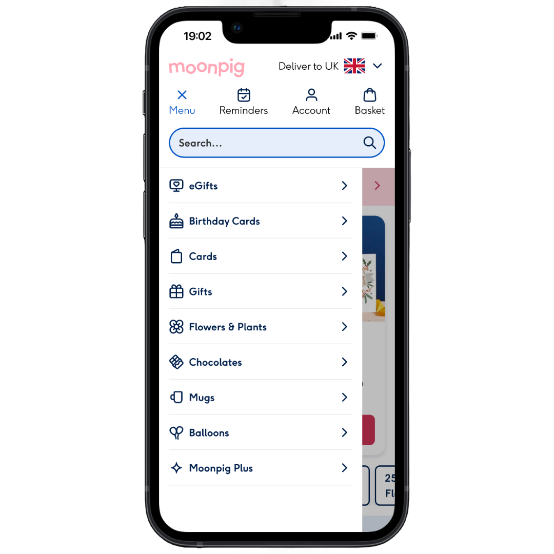
I designed a bespoke icon set to reflect existing categories while aligning with our system. The icons enhance scannability, reduce cognitive load, and reinforce our brand identity.
To ensure consistency, I followed these design rules:
- 1px safe space
- 2px centred strokes
- Rounded joins and caps
Before and after
To ensure scalability, I considered longer category names and worked closely with developers to make sure that icon spacing and tap targets remained accessible.
Control: mobile menu no icons
Variant: mobile menu with icons
RESULTS
Improved scannability
10% reduction in time to select mobile menu category within the variant.
-10%
Time to select category
Reduce drop-off rate
0.14% decrease in drop-off rate from mobile menu to gallery in the variant.
-0.14%
Mobile menu to gallery drop-off
Increase in conversion
0.44% increase in conversion on users completing a purchase within the variant.
+0.44%
Conversion
LEARNINGS
Reflecting on project
and outcomes
01
Walk, don’t run!
When we landed on icons as the solution, I was eager to jump straight into design. However, I quickly realised I didn’t yet have the depth of knowledge needed. This reminded me that sometimes it’s better to pause, research, and build confidence before diving in.
02
The devil is in the details
Designing icons isn’t just about aesthetics—it’s about clarity, consistency, and communication. I learned how even a single misplaced pixel, inconsistent stroke width, or spacing misalignment can impact the final product.
03
You don’t have to user test everything
Don’t get me wrong, user testing is powerful—but not always necessary. For lower-risk, quick-win improvements like this, I learned it’s okay to lean on design intuition, team feedback, and A/B testing to move forward with confidence.
04
Small changes also make a difference
At first, I wasn’t sure if adding icons to the menu would make much of an impact. But the results proved otherwise. It made me realise once again that small, iterative improvements also influence user behaviour.

Home
More to explore...
New feature visibility

1.4% increase in conversion
Introduced a new feature in the happy path to improve visibility and boost feature usage. Led to a 1.4% lift in conversion and 0.64% increase in group card project creations.
UX/UI • E2E • Shipped • 2024
Log in incentive

0.2% decrease in conversion
Designed new account page and tested a delayed ‘tooltip’ to nudge users to login—increasing login rates, but negatively impacted conversion. Account page redesign was implemented, but tooltip wasn’t shipped.
UX/UI • Not shipped • 2024
Want to collaborate?

Let’s talk

Send an email


Links
Work
About me
Design process
Download resume
Work
About me
Design process
Resume
DH
Menu bespoke icons, uplift in conversion
Mobile menu bespoke icons
Use visual elements to help users find what they need quicker in mobile menu
One of the biggest challenges for users is finding the perfect card or gift for their recipient(s). This process takes the longest and is where we see the highest drop-off in the user journey.
To address this, we began researching ways to help users find what they need more quickly. We decided to break this larger problem into smaller, manageable parts. Based on this, we started with the mobile menu, as it requires minimal engineering effort and can be A/B tested within 2-3 weeks.
Problem
Users struggle to find the perfect card or gift—resulting in the highest drop-off point in the user journey.
Outcome
Designed bespoke icons to improve menu clarity and speed up navigation—resulting in a 0.44% uplift in conversion and 10% reduction in time to select category.
Timeline
Oct 2023 — Nov 2023
Role
Product Designer
Team
1 midweight designer (me), 1 product manager, team of developers
Tools
Figma
Miro
JIRA
Slack
Google suite
DISCOVER
Competitor analysis
explore visual elements in menus
Researched direct and indirect competitors to identify existing patterns and opportunities for ideation.
Adidas: Emojis
Low effort:
Easy to implement, no design effort
Pros:
Familiar, are easily recognised, could be fun?
Cons:
Does not align with brand, looks a bit cheap
Edge cases:
Difficult to find emojis that represent certain categories
Hallmark: icons
Mid-low effort:
Easy to implement, medium design effort
Pros:
Clean, easy to scan, aligns with branding tone
Cons:
Could be ambiguous, e.g. hiring icon in dribbble
Edge cases:
Niche categories can be difficult to create icon
IKEA: product images
Mid effort:
High quality & consistent product images needed
Pros:
Realistic representation of products, could be used to inspire users
Cons:
Products of different shapes/sizes, could look messy
Edge cases:
When adapting menu categories, images must remain consistent
Other: personalised menu
High effort:
A lot of engineering effort, mid design effort
Pros:
Can help inspire users, prioritise most visited categories
Cons:
Requires users to be logged in, algorithm be ‘wrong’
Edge cases:
Difficult to balance overrides for peak occasions
DEFINE
Define key metrics
measure impact
01
Reduce time to select mobile mnu category by 15%
Reducing time spent looking for a category improves the user experience, driving engagement and reducing drop-offs.
02
Decrease mobile menu drop-off rate by 10bps
While the change is small, improving clarity in the mobile menu can reduce early friction.
03
Increase conversion by 30bps
A 30bps conversion uplift at this stage drives meaningful revenue at scale, showing that clearer navigation helps users complete their journey.
IDEATION
Ideas mapped based
on effort, user benefit & feasibility
To prioritise the top ideas, I created a matrix to evaluate effort, user benefit and feasibility per idea. User benefit criteria was based on the following:
- Improves findability & navigation
- Enhances the browsing experience
- Aligns with user expectations
Based on the criteria, we chose bespoke icons for categories as the optimal solution to improve findability in the mobile menu due to the following reasons:
- Scannability: Icons enhance visual scanning, allowing users to quickly identify categories.
- Cognitive load reduction: Recognisable icons simplify navigation and decision-making.
- Brand alignment: Icons reinforce our brand identity and visual language.
- User expectations: Icons meet user familiarity in mobile interfaces.
- Ease of implementation: This solution can be implemented quickly with minimal engineering effort.
Once we decided on this, I complied a list of icons needed for all menu categories.
Ideation workshop
sketches & hi-fi
I gathered a few designers to ideate for the most complex icon (eGifts). I decided to focus on that icon to have an anchor for the rest of the icons. At the end, we dot voted on the top icons.
FINAL DESIGN
12 icons to
enhance menu clarity
I designed a bespoke icon set to reflect existing categories while aligning with our system. The icons enhance scannability, reduce cognitive load, and reinforce our brand identity.
To ensure consistency, I followed these design rules:
- 1px safe space
- 2px centred strokes
- Rounded joins and caps
Before and after
To ensure scalability, I considered longer category names and worked closely with developers to make sure that icon spacing and tap targets remained accessible.
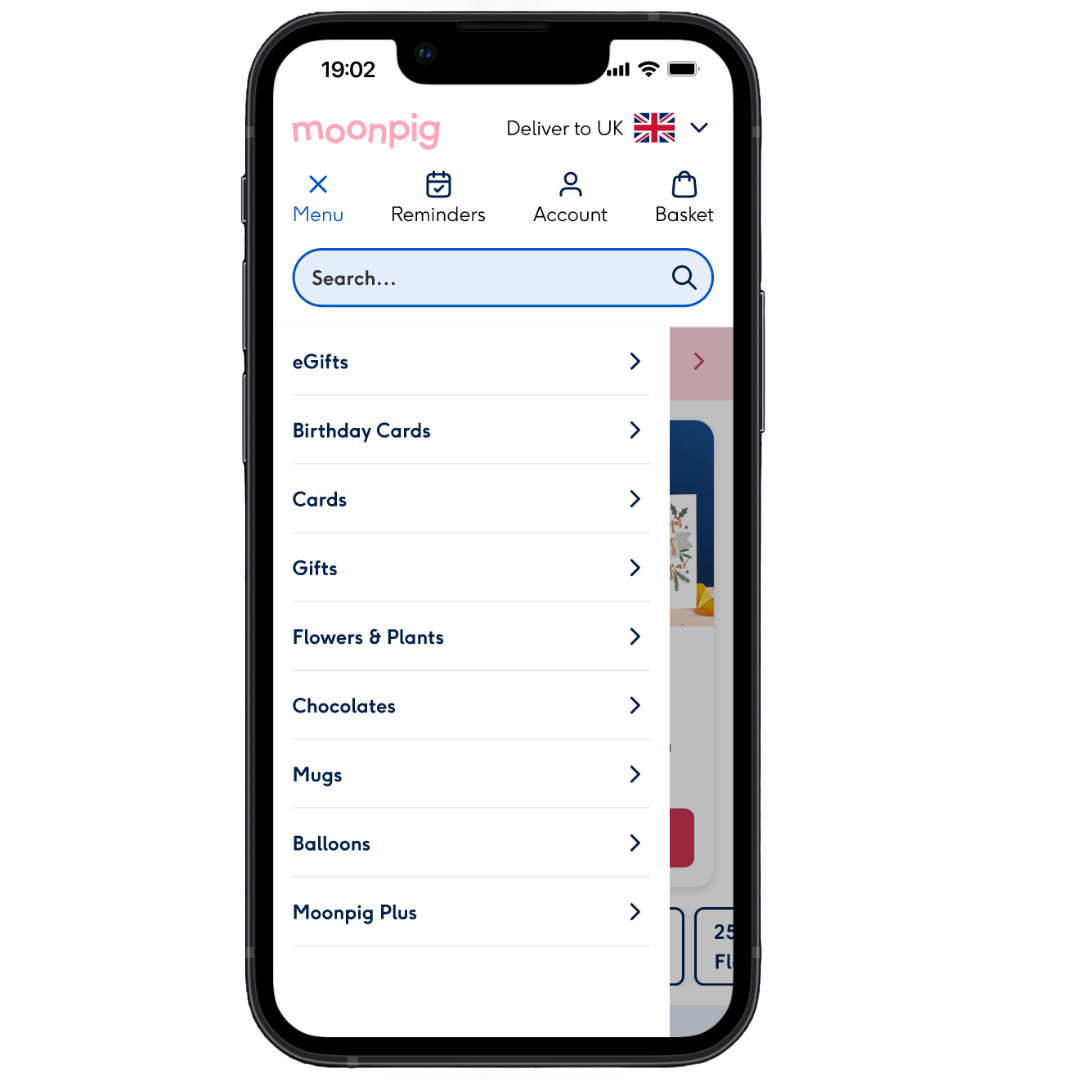
Control: mobile menu no icons
Variant: mobile menu with icons
RESULTS
Improved scannability
10% reduction in time to select mobile menu category within the variant.
-10%
Time to select category
Reduce drop-off rate
0.14% decrease in drop-off rate from mobile menu to gallery in the variant.
-0.14%
Mobile menu to gallery drop-off
Increase in conversion
0.44% increase in conversion on users completing a purchase within the variant.
+0.44%
Conversion
LEARNINGS
Reflecting on project
and outcomes
01
Walk, don’t run!
When we landed on icons as the solution, I was eager to jump straight into design. However, I quickly realised I didn’t yet have the depth of knowledge needed. This reminded me that sometimes it’s better to pause, research, and build confidence before diving in.
02
The devil is in the details
Designing icons isn’t just about aesthetics—it’s about clarity, consistency, and communication. I learned how even a single misplaced pixel, inconsistent stroke width, or spacing misalignment can impact the final product.
03
You don’t have to user test everything
Don’t get me wrong, user testing is powerful—but not always necessary. For lower-risk, quick-win improvements like this, I learned it’s okay to lean on design intuition, team feedback, and A/B testing to move forward with confidence.
04
Small changes also make a difference
At first, I wasn’t sure if adding icons to the menu would make much of an impact. But the results proved otherwise. It made me realise once again that small, iterative improvements also influence user behaviour.
Home
More to explore...
New feature visibility
1.4% increase in conversion
Introduced a new feature in the happy path to improve visibility and boost feature usage. Led to a 1.4% lift in conversion and 0.64% increase in group card project creations.
UX/UI • E2E • Shipped • 2024
Log in incentive
0.2% decrease in conversion
Designed new account page and tested a delayed ‘tooltip’ to nudge users to login—increasing login rates, but negatively impacted conversion. New account page was implemented, but tooltip wasn’t shipped.
UX/UI • Not shipped • 2024
Want to collaborate?

Let’s talk
Send an email
Links
Work
About me
Design process
Download resume
D
H
Menu bespoke icons, uplift in conversion
Mobile menu bespoke icons
Use visual elements to help users find what they need quicker in mobile menu
One of the biggest challenges for users is finding the perfect card or gift for their recipient(s). This process takes the longest and is where we see the highest drop-off in the user journey.
To address this, we began researching ways to help users find what they need more quickly. We decided to break this larger problem into smaller, manageable parts. Based on this, we started with the mobile menu, as it requires minimal engineering effort and can be A/B tested within 2-3 weeks.
Problem
Users struggle to find the perfect card or gift—resulting in the highest drop-off point in the user journey.
Outcome
Designed bespoke icons to improve menu clarity and speed up navigation—resulting in a 0.44% uplift in conversion and 10% reduction in time to select category.
Role
Product Designer
Timeline
Oct 2023 — Nov 2023
Team
1 midweight designer (me), 1 product manager, team of developers
Tools
Figma
Miro
Usertesting.com
Hotjar
JIRA
Slack
Google suite
DISCOVER
Competitor analysis
explore visual elements in menus
Researched direct and indirect competitors to identify existing patterns and opportunities for ideation.
Adidas: Emojis
Low effort:
Easy to implement, no design effort
Pros:
Familiar, are easily recognised, could be fun?
Cons:
Does not align with brand tone, looks a bit cheap
Edge cases:
Difficult to find emojis that represent certain categories
Hallmark: icons
Mid-low effort:
Easy to implement, medium design effort
Pros:
Clean, easy to scan, aligns with branding tone
Cons:
Could be ambiguous, e.g. hiring icon in dribbble
Edge cases: Niche categories can be difficult to create icon
IKEA: product images
Mid effort:
High quality & consistent product images needed
Pros:
Realistic representation of products, could be used to inspire users
Cons:
Products of different shapes/sizes, could look messy
Edge cases:
When adapting menu categories, images must remain consistent
Other: personalised menu
High effort:
A lot of engineering effort, mid design effort
Pros:
Can help inspire users, prioritise most visited categories
Cons:
Requires users to be logged in, algorithm be ‘wrong’
Edge cases:
Difficult to balance overrides for peak occasions
DEFINE
Define key metrics
measure impact
01
Reduce time to select mobile mnu category by 15%
Reducing time spent looking for a category improves the user experience, driving engagement and reducing drop-offs.
02
Decrease mobile menu drop-off rate by 10bps
While the change is small, improving clarity in the mobile menu can reduce early friction.
03
Increase conversion by 30bps
A 30bps conversion uplift at this stage drives meaningful revenue at scale, showing that clearer navigation helps users complete their journey.
IDEATION
Ideas mapped based
on effort, user benefit & feasibility
To prioritise the top ideas, I created a matrix to evaluate effort, user benefit and feasibility per idea. User benefit criteria was based on the following:
- Improves findability & navigation
- Enhances the browsing experience
- Aligns with user expectations
Based on the criteria, we chose bespoke icons for categories as the optimal solution to improve findability in the mobile menu due to the following reasons:
- Scannability: Icons enhance visual scanning, allowing users to quickly identify categories.
- Cognitive load reduction: Recognisable icons simplify navigation and decision-making.
- Brand alignment: Icons reinforce our brand identity and visual language.
- User expectations: Icons meet user familiarity in mobile interfaces.
- Ease of implementation: This solution can be implemented quickly with minimal engineering effort.
Once we decided on this, I complied a list of icons needed for all menu categories.
Ideation workshop
sketches & hi-fi
I gathered a few designers to ideate for the most complex icon (eGifts). I decided to focus on that icon to have an anchor for the rest of the icons. At the end, we dot voted on the top icons.
FINAL DESIGN
12 icons to
enhance menu clarity
I designed a bespoke icon set to reflect existing categories while aligning with our system. The icons enhance scannability, reduce cognitive load, and reinforce our brand identity.
To ensure consistency, I followed these design rules:
- 1px safe space
- 2px centred strokes
- Rounded joins and caps
Before and after
To ensure scalability, I considered longer category names and worked closely with developers to make sure that icon spacing and tap targets remained accessible.
Control: mobile menu no icons
Variant: mobile menu with icons
RESULTS
Improved scannability
10% reduction in time to select mobile menu category within the variant.
-10%
Time to select category
Reduce drop-off rate
0.14% decrease in drop-off rate from mobile menu to gallery in the variant.
-0.14%
Mobile menu to gallery drop-off
Increase in conversion
0.44% increase in conversion on users completing a purchase within the variant.
+0.44%
Conversion
LEARNINGS
Reflecting on project
and outcomes
01
Walk, don’t run!
When we landed on icons as the solution, I was eager to jump straight into design. However, I quickly realised I didn’t yet have the depth of knowledge needed. This reminded me that sometimes it’s better to pause, research, and build confidence before diving in.
02
The devil is in the details
Designing icons isn’t just about aesthetics—it’s about clarity, consistency, and communication. I learned how even a single misplaced pixel, inconsistent stroke width, or spacing misalignment can impact the final product.
03
You don’t have to user test everything
Don’t get me wrong, user testing is powerful—but not always necessary. For lower-risk, quick-win improvements like this, I learned it’s okay to lean on design intuition, team feedback, and A/B testing to move forward with confidence.
04
Small changes also make a difference
At first, I wasn’t sure if adding icons to the menu would make much of an impact. But the results proved otherwise. It made me realise once again that small, iterative improvements also influence user behaviour.
Home
More to explore...
New feature visibility
1.4% increase in conversion
Introduced a new feature in the happy path to improve visibility and boost feature usage. Led to a 1.4% lift in conversion and 0.64% increase in group card project creations.
UX/UI • E2E • Shipped • 2024
Log in incentive
0.2% decrease in conversion
Designed new account page and tested a delayed ‘tooltip’ to nudge users to login—increasing login rates, but negatively impacting conversion. New account page was implemented, but tooltip wasn’t shipped.
UX/UI • Not shipped • 2024
Want to collaborate?
Let’s talk
Send an email
Links
Work
About me
Design process
Download resume