DH

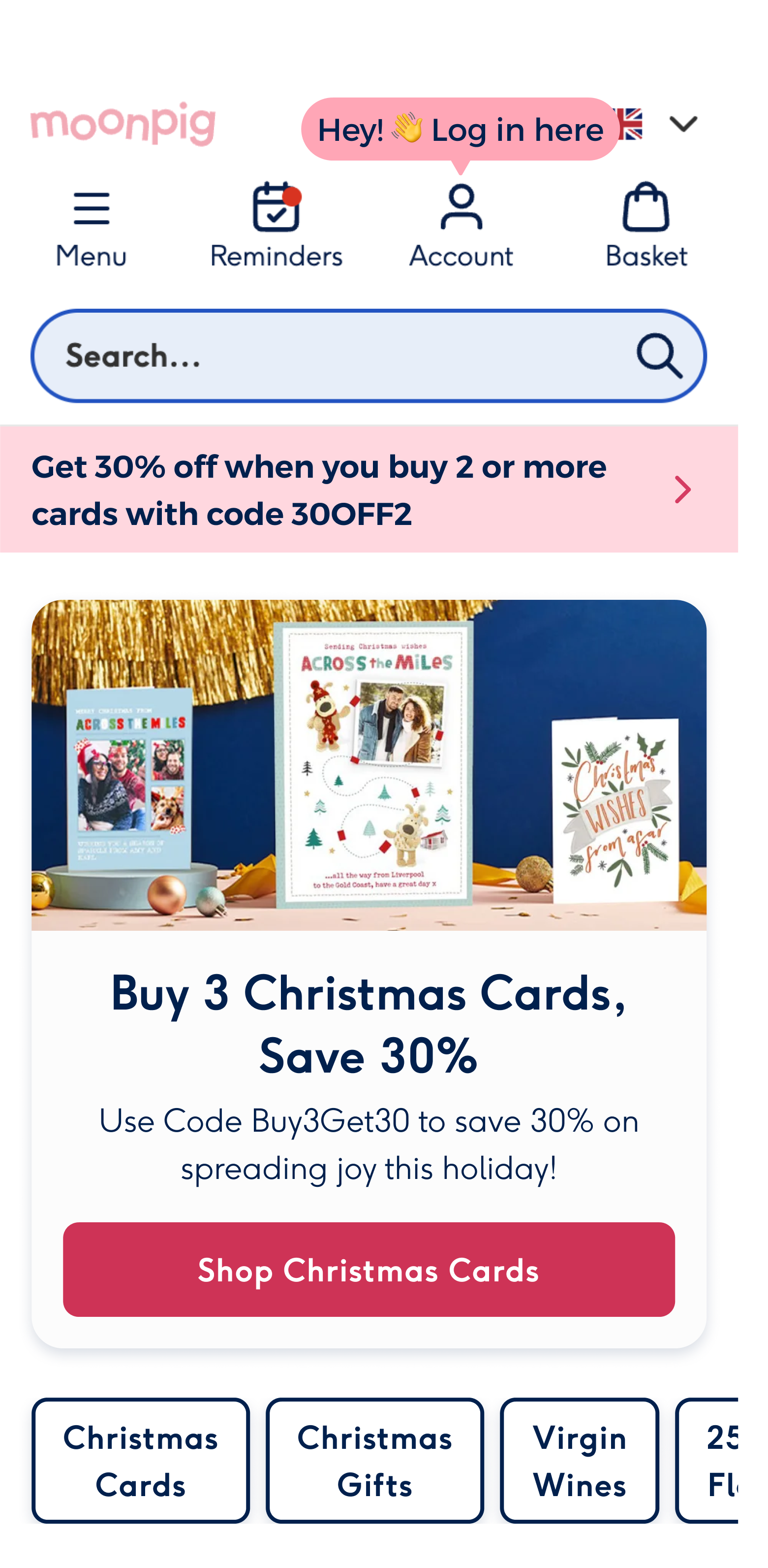
Nudge users to login to power personalisation
User research
results & insights
Amazon app
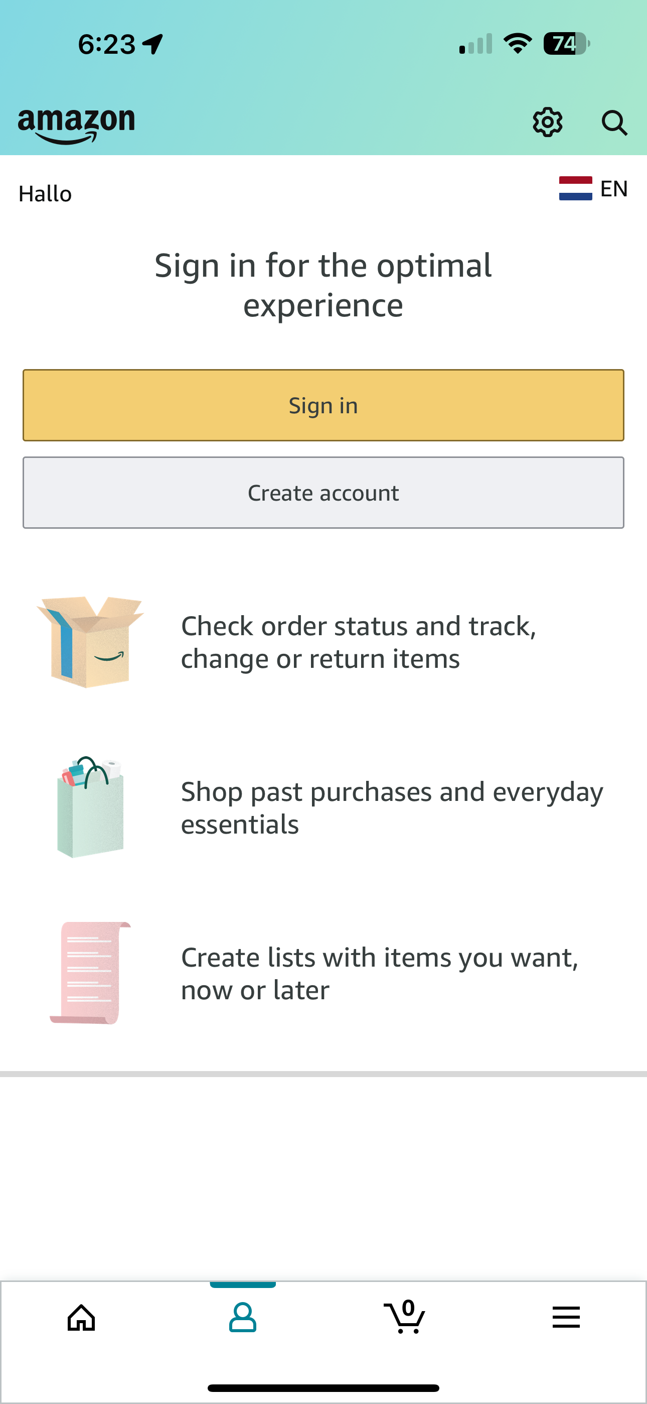
Showcase benefits of logging in
Nice copy, emphasising experience
Amazon web
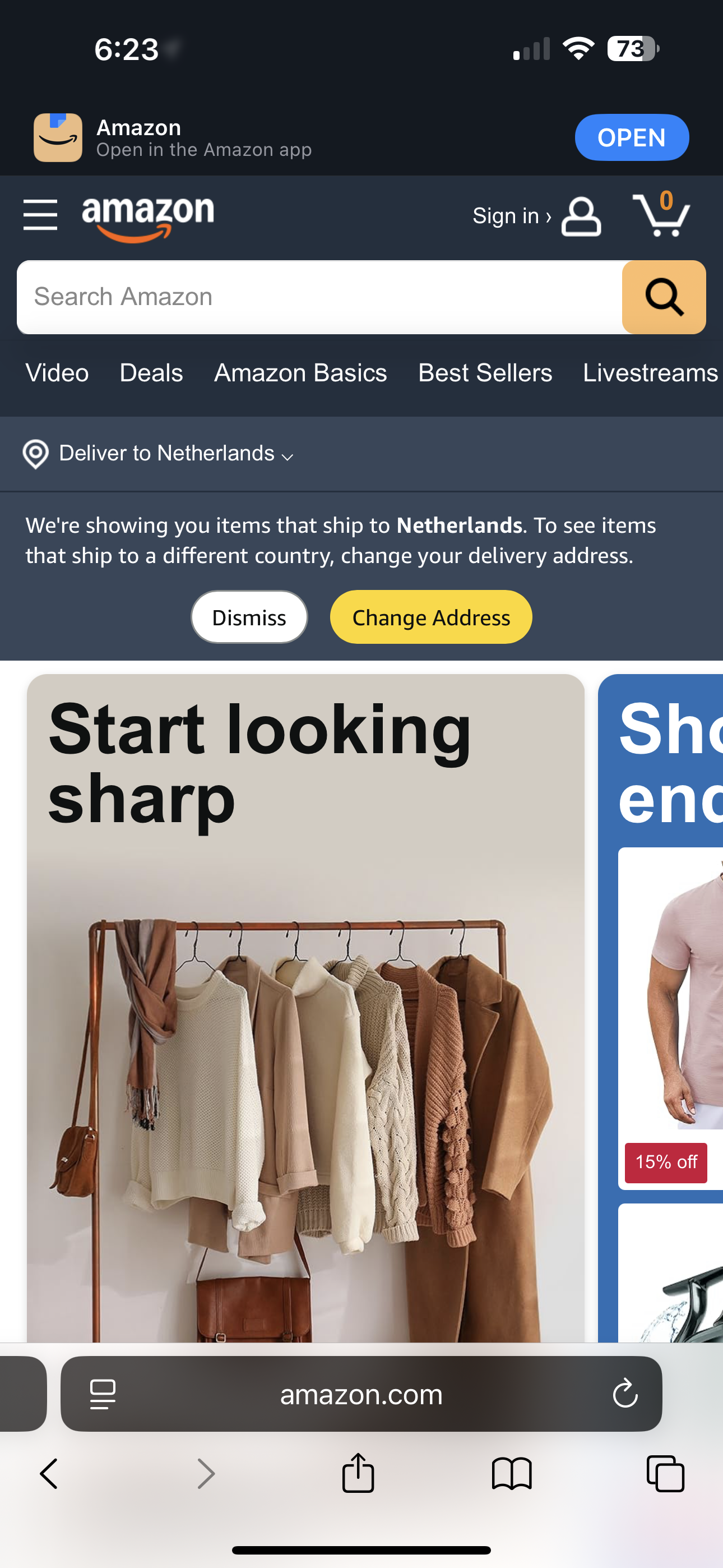
Small nudge to sign in, priority of signing in vs. creating account
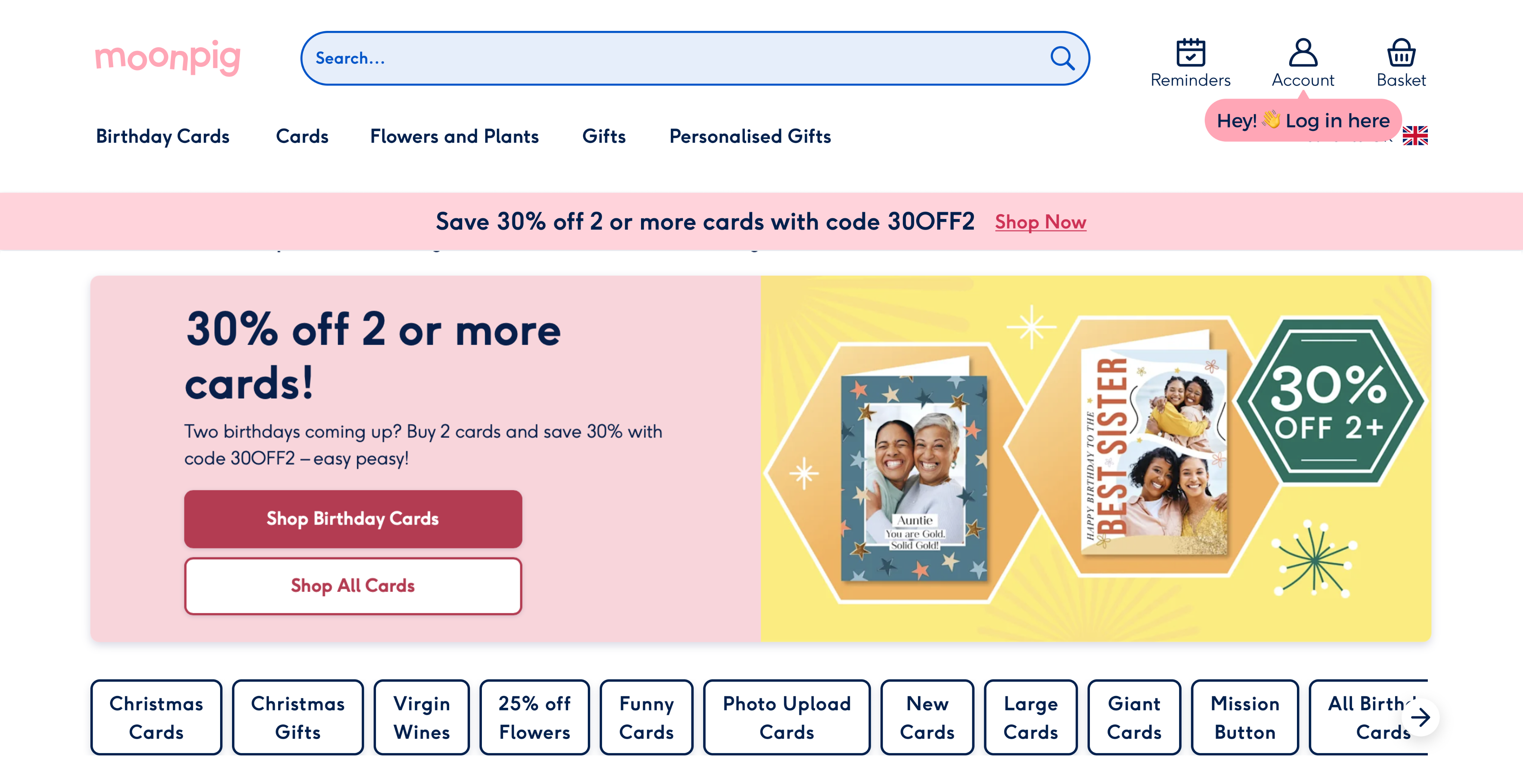
Nike
Showcase benefits of logging in
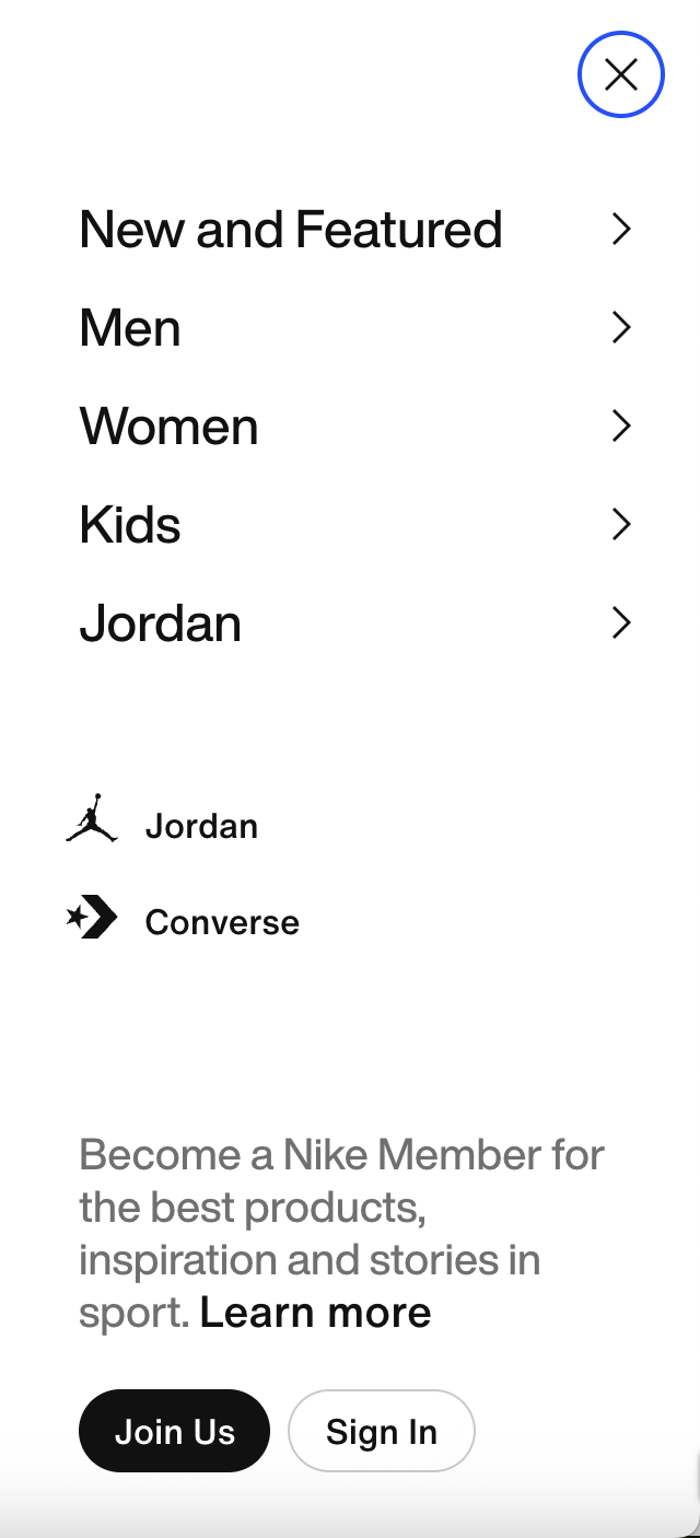
Adidas
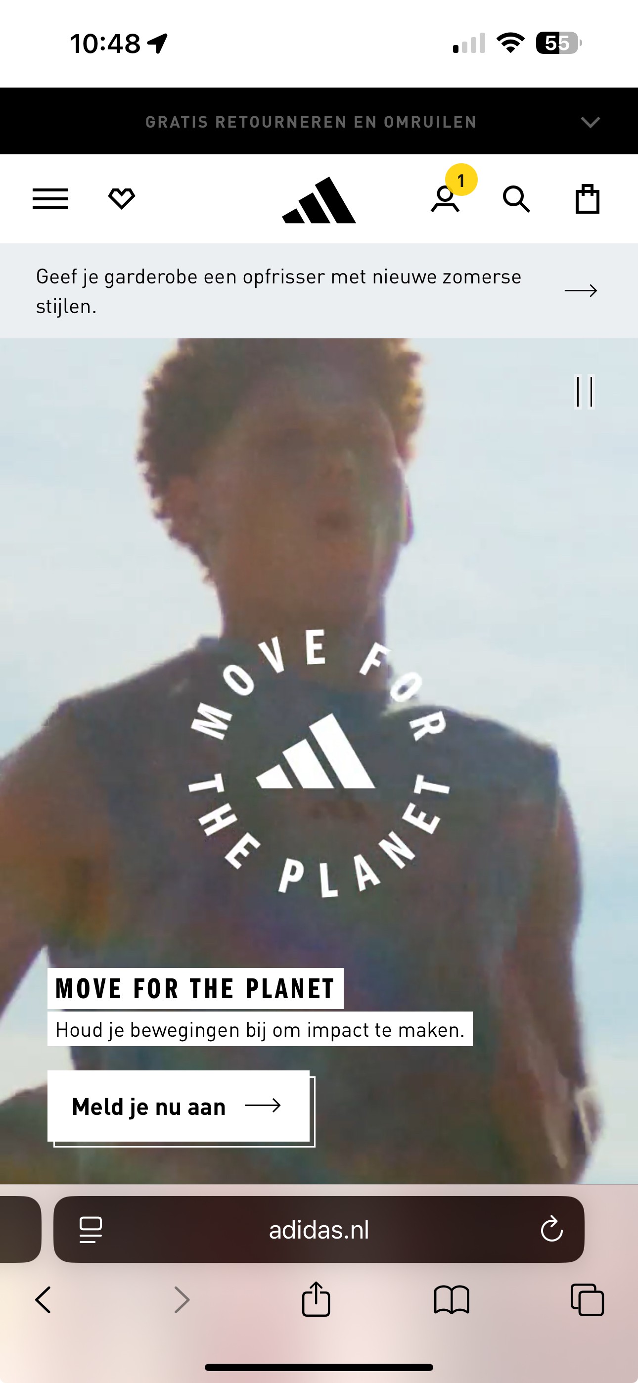
Micro interaction to nudge logins
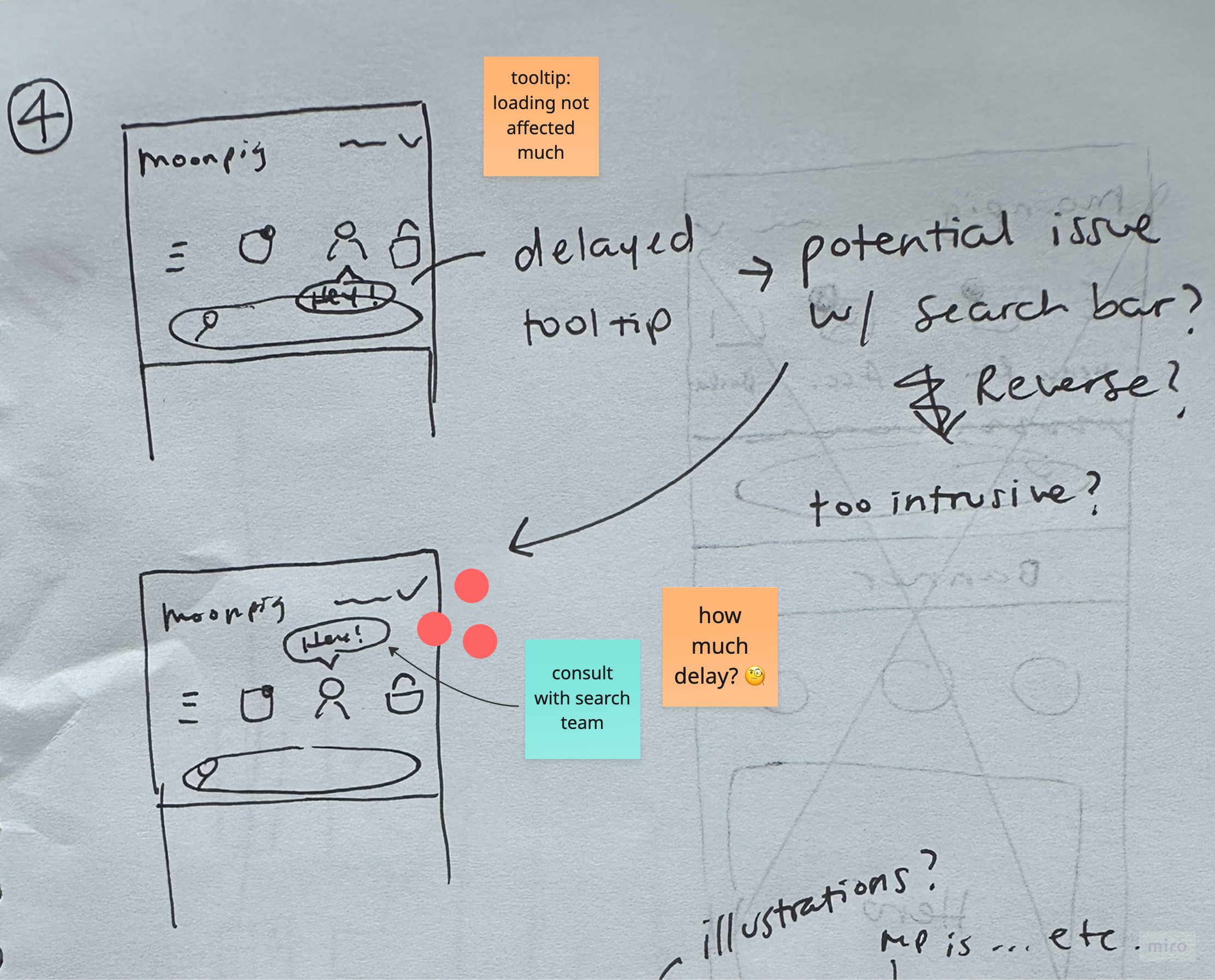

Before
Most users noticed the tooltip, but some feedback suggested the tone felt too formal. The Search team flagged concerns about it overlapping the search bar. The timing of the delay also felt slightly off.
After
Refined the copy to be more approachable and added an emoji for warmth. Repositioned the tooltip above the icon to avoid obstructing search, and reduced the delay for a smoother experience.
Before
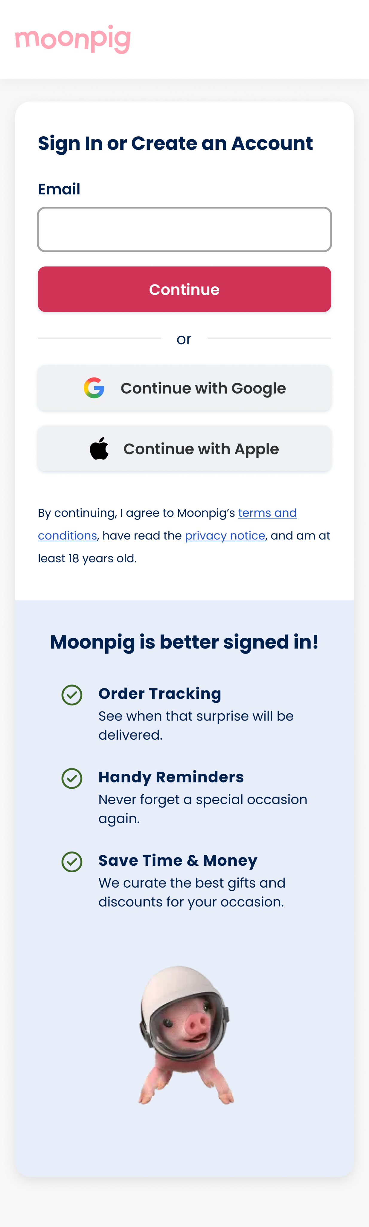
Users found "exclusive discounts" unclear, and we also felt it was misleading as we don’t offer true exclusivity for discounts. The header also felt too long, impacting readability.
After
Simplified copy for clarity and brand alignment. Revised benefit titles to better reflect current offerings and maintain consistency with Moonpig’s tone of voice.

Home
More to explore...
Menu iconography

0.4% increase in conversion
New feature visibility
1.4% increase in conversion
Want to collaborate?

Let’s talk

Send an email


DH
Nudge users to login to power personalisation
User research
results & insights
Amazon app
Showcase benefits of logging in
Nice copy, emphasising experience
Amazon web
Small nudge to sign in, priority of signing in vs. creating account
Nike
Showcase benefits of logging in
Adidas
Micro interaction to nudge logins
01
02
IDEATION
Before
Most users noticed the tooltip, but some feedback suggested the tone felt too formal. The Search team flagged concerns about it overlapping the search bar. The timing of the delay also felt slightly off.
After
Refined the copy to be more approachable and added an emoji for warmth. Repositioned the tooltip above the icon to avoid obstructing search, and reduced the delay for a smoother experience.
Before
Users found "exclusive discounts" unclear, and we also felt it was misleading as we don’t offer true exclusivity for discounts. The header also felt too long, impacting readability.
After
Simplified copy for clarity and brand alignment. Revised benefit titles to better reflect current offerings and maintain consistency with Moonpig’s tone of voice.
Home
More to explore...
New feature visibility
1.4% increase in conversion
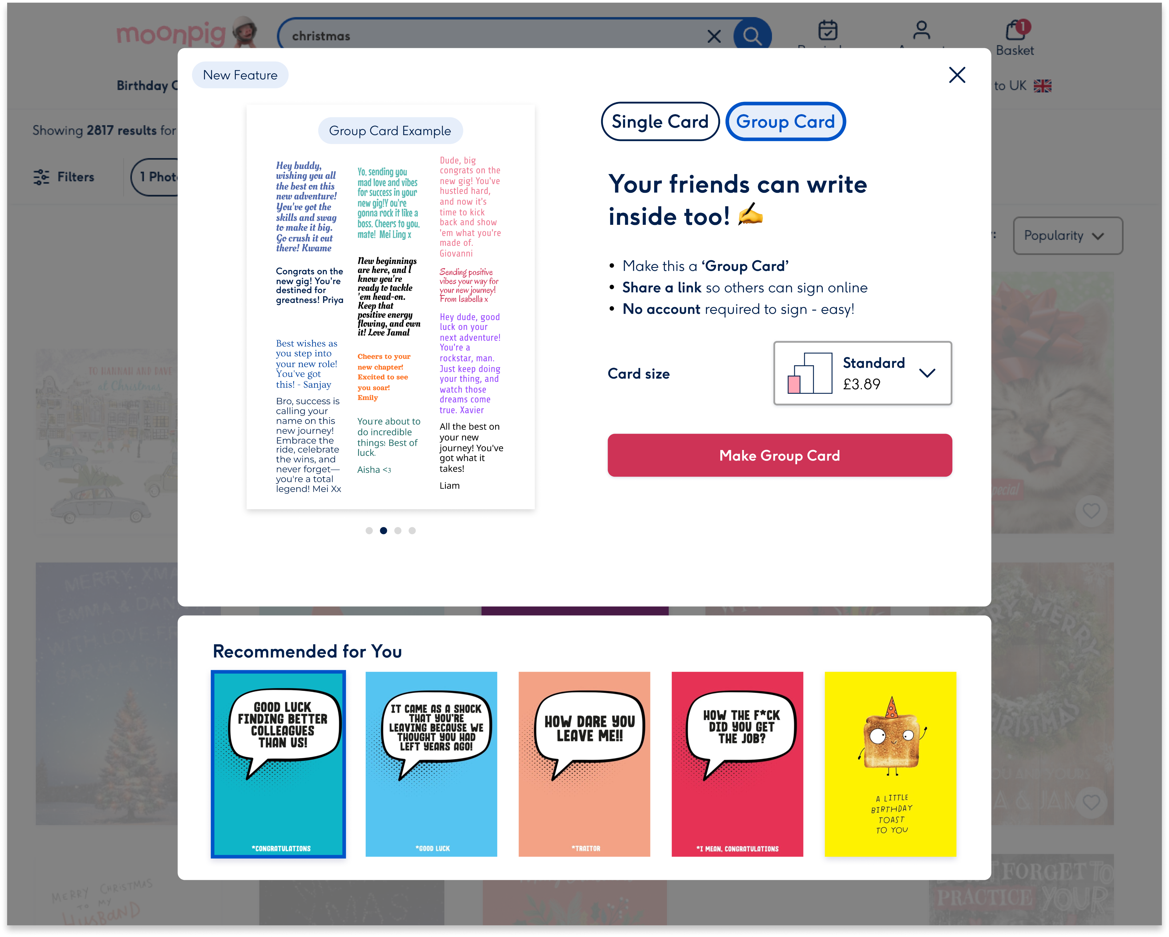
Introduced a new feature in the happy path to improve visibility and boost feature usage. Led to a 1.4% lift in conversion and 0.64% increase in group card project creations.
UX/UI • E2E • Shipped • 2024
Menu iconography
0.4% increase in conversion
Want to collaborate?

Let’s talk
Send an email
D
H


Nudge users to login to power personalisation
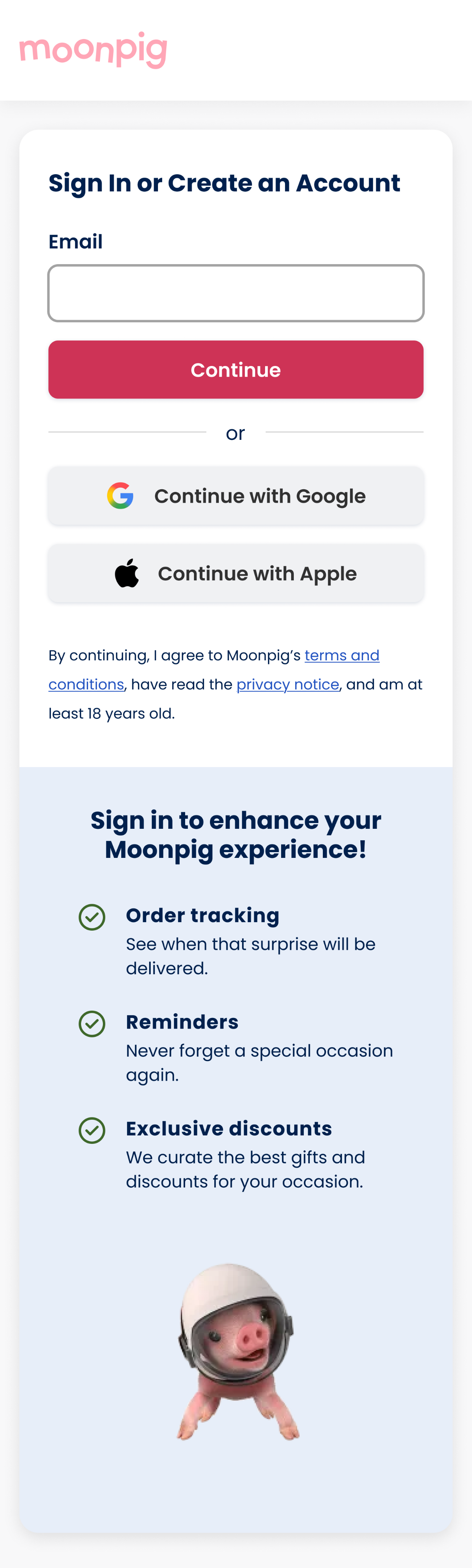
Problem
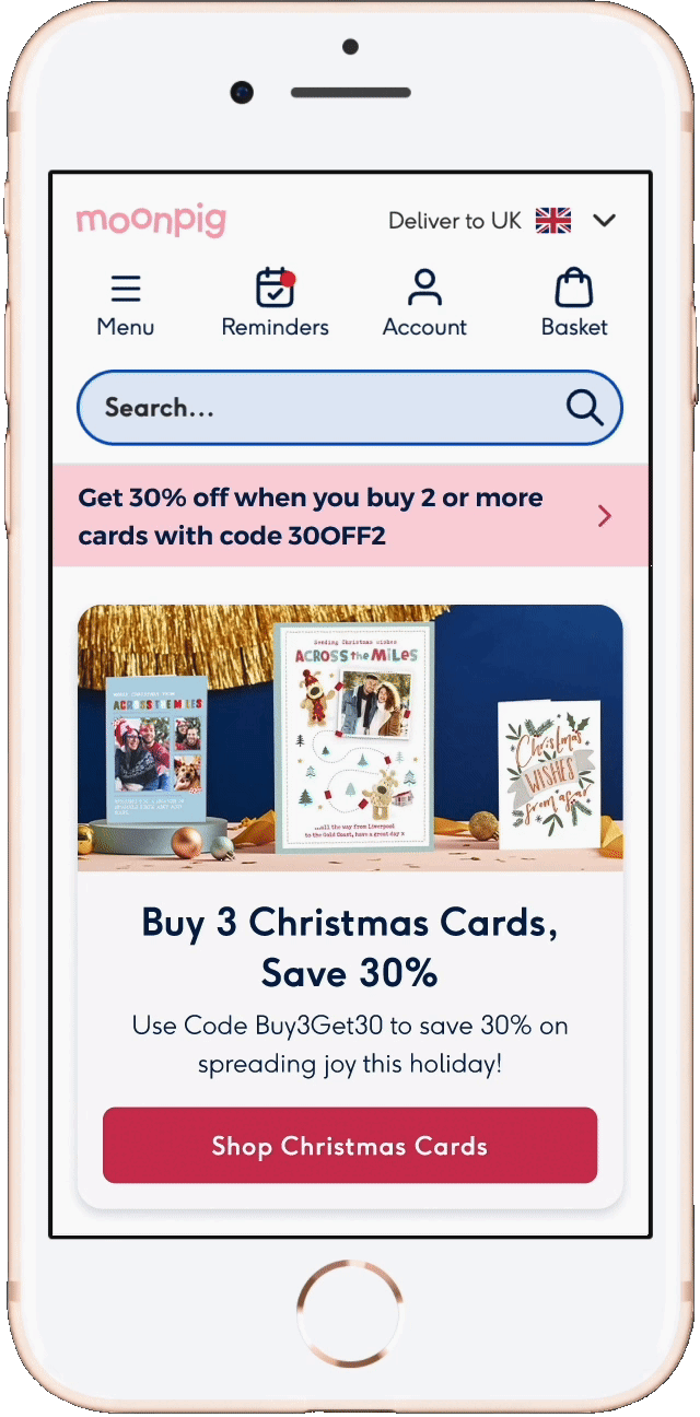
Group cards is one of Moonpig’s most exciting features, yet it accounts for 0.2% of total orders. Users struggle to discover it organically, highlighting a clear visibility issue in the core journey.
Outcome
The tooltip led to a modest increase in login rates, but negatively impacted conversion, leading to the decision to not roll out the variant. However, the account page redesign was implemented.
User research
results & insights
Amazon app
Showcase benefits of logging in
Nice copy, emphasising experience
Amazon web
Small nudge to sign in, priority of signing in vs. creating account
Nike
Showcase benefits of logging in
Adidas
Micro interaction to nudge logins
01
02
IDEATION
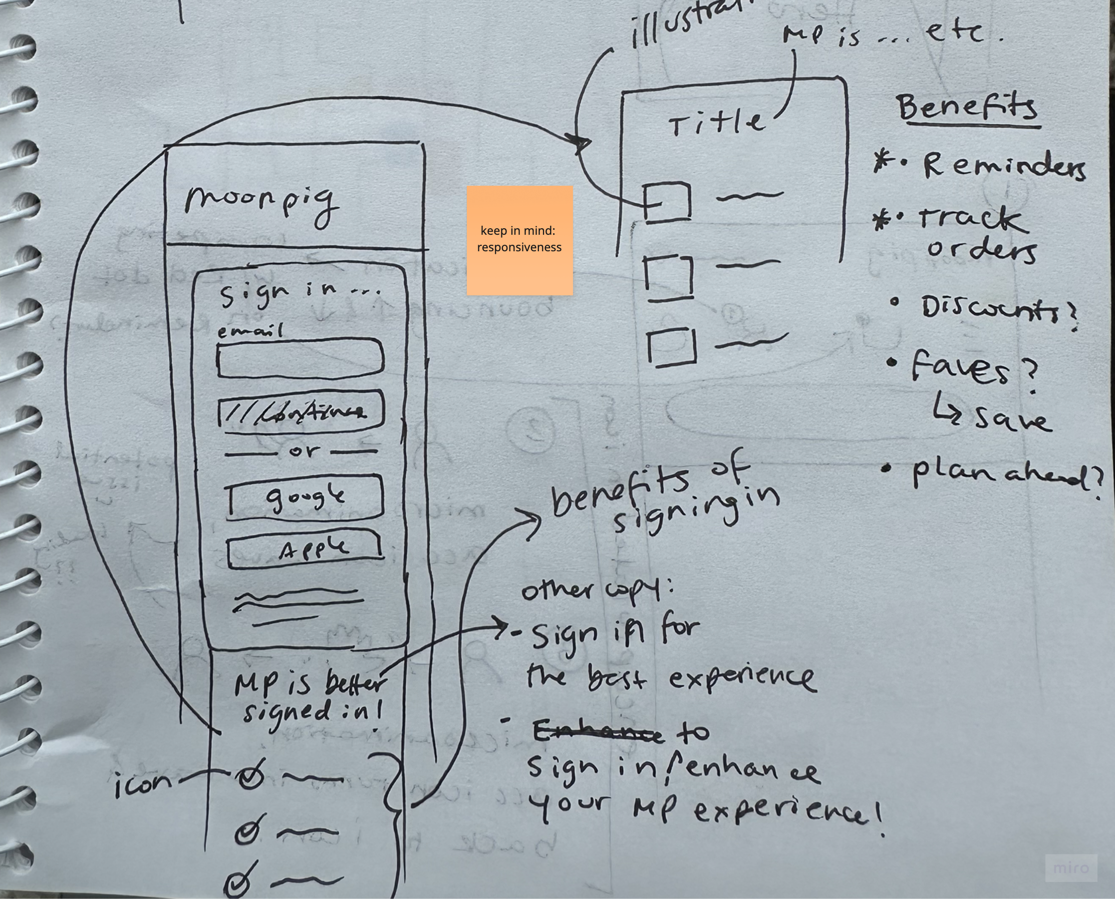
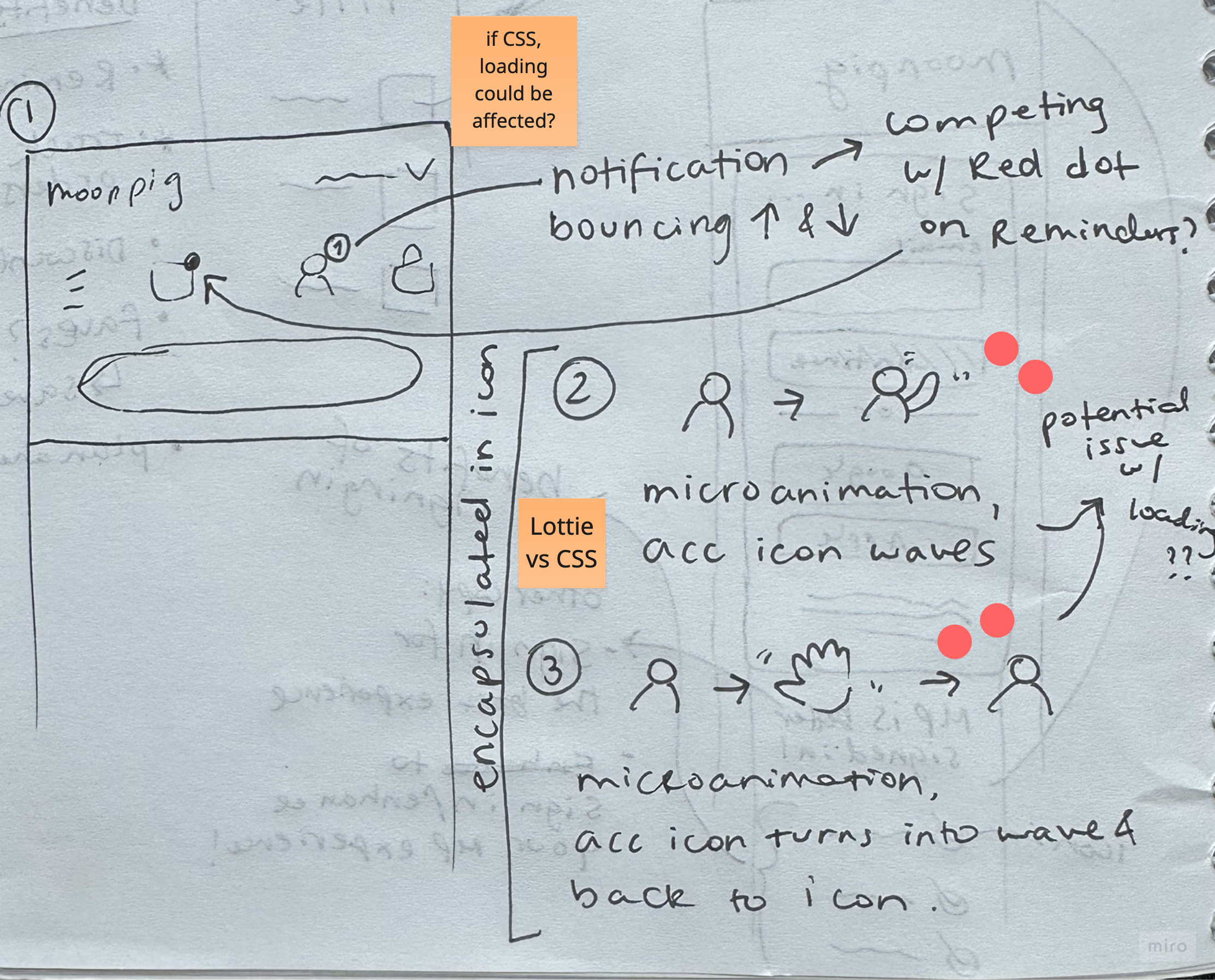
Sketches
initial ideation
Ideated potential solutions to incentivise logins and redesigning the account page. Shared sketches with the PM, EM and 6 engineers, where they dot voted the top ideas based on feasibility and design.
Before
Most users noticed the tooltip, but some feedback suggested the tone felt too formal. The Search team flagged concerns about it overlapping the search bar. The timing of the delay also felt slightly off.
After
Refined the copy to be more approachable and added an emoji for warmth. Repositioned the tooltip above the icon to avoid obstructing search, and reduced the delay for a smoother experience.
Before
Users found "exclusive discounts" unclear, and we also felt it was misleading as we don’t offer true exclusivity for discounts. The header also felt too long, impacting readability.
After
Simplified copy for clarity and brand alignment. Revised benefit titles to better reflect current offerings and maintain consistency with Moonpig’s tone of voice.
Home
More to explore...
New feature visibility
1.4% increase in conversion
Menu iconography
0.4% increase in conversion
Want to collaborate?
Let’s talk
Send an email
Links
Work
About me
Design process
Download resume