Work

About me

Design process

Resume

DH

Nudge users to login to power personalisation

Login tooltip nudge

Encourage users to login at the top of the funnel to power personalisation.

At Moonpig, one of the biggest challenges users face is finding the perfect card or gift. We assume that personalisation can help by surfacing relevant content early in the journey.

However, around 70% of users who land on the homepage are logged out, limiting our ability to tailor their experience. I explored low-effort, high-impact ways to encourage users to log in.I designed a delayed ‘tooltip’ on the account icon to nudge users to sign in. While this led to an increase in logins, it also negatively impacted conversion, so we decided not to roll out the variant.Additionally, I revamped the account page to clearly communicate the benefits of logging in or creating an account; which was successfully implemented.

Problem

Group cards is one of Moonpig’s most exciting features, yet it accounts for 0.2% of total orders. Users struggle to discover it organically, highlighting a clear visibility issue in the core journey.

Outcome

The tooltip led to a modest increase in login rates, but negatively impacted conversion, leading to the decision to not roll out the variant. However, the account page redesign was implemented.

Role

Product Designer

Timeline

Feb — Mar 2024

Team

1 midweight designer (me), 1 product manager, team of developers

Tools

Figma

Miro

Google Analytics

Usertesting.com

Hotjar

JIRA

Slack

Google suite

Role

Product Designer

Timeline

Dec 2023 — Mar 2024

Team

1 midweight designer (me), 1 principal designer, 1 product manager, 1 delivery manager, team of developers

Tools

Figma

Miro

Usertesting.com

Hotjar

JIRA

Slack

Google suite

DISCOVER

User research

process & plan

Conducted several forms of research to understand the current space and identify opportunities. With my team, we also assessed previous strategies to boost login rates.

01

Hotjar observations

01

Observed 30 recordings of users that land on the homepage and click/tap on the account button.

02

Competitor analysis

01

Analysed 6 industry leaders—Adidas, Nike, IKEA, Booking.com, Amazon, and Airbnb—to explore login strategies.

03

7 unmoderated usertests

01

Conducted 7 unmoderated usertests with Moonpig customers & non-customers to evaluate the effectiveness and subtly of the delayed tooltip on the homepage. Additionally, assessed the usability and clarity of the redesigned account page.

04

Historical strategies analysis

01

Reviewed previous A/B tests and design efforts geared to increase logins to understand past successes and failures.

User research

results & insights

01

Hotjar: 84% of users login to track or view past orders

Of the 30 users observed in Hotjar:

  • 84% logged in to view previous purchases or track orders
  • 15% attempted to log in, but couldn't recall their password
  • 1% logged in to access occasion reminders

02

Comp analysis: industry leaders use a mix of nudges & showcasing benefits of logging in

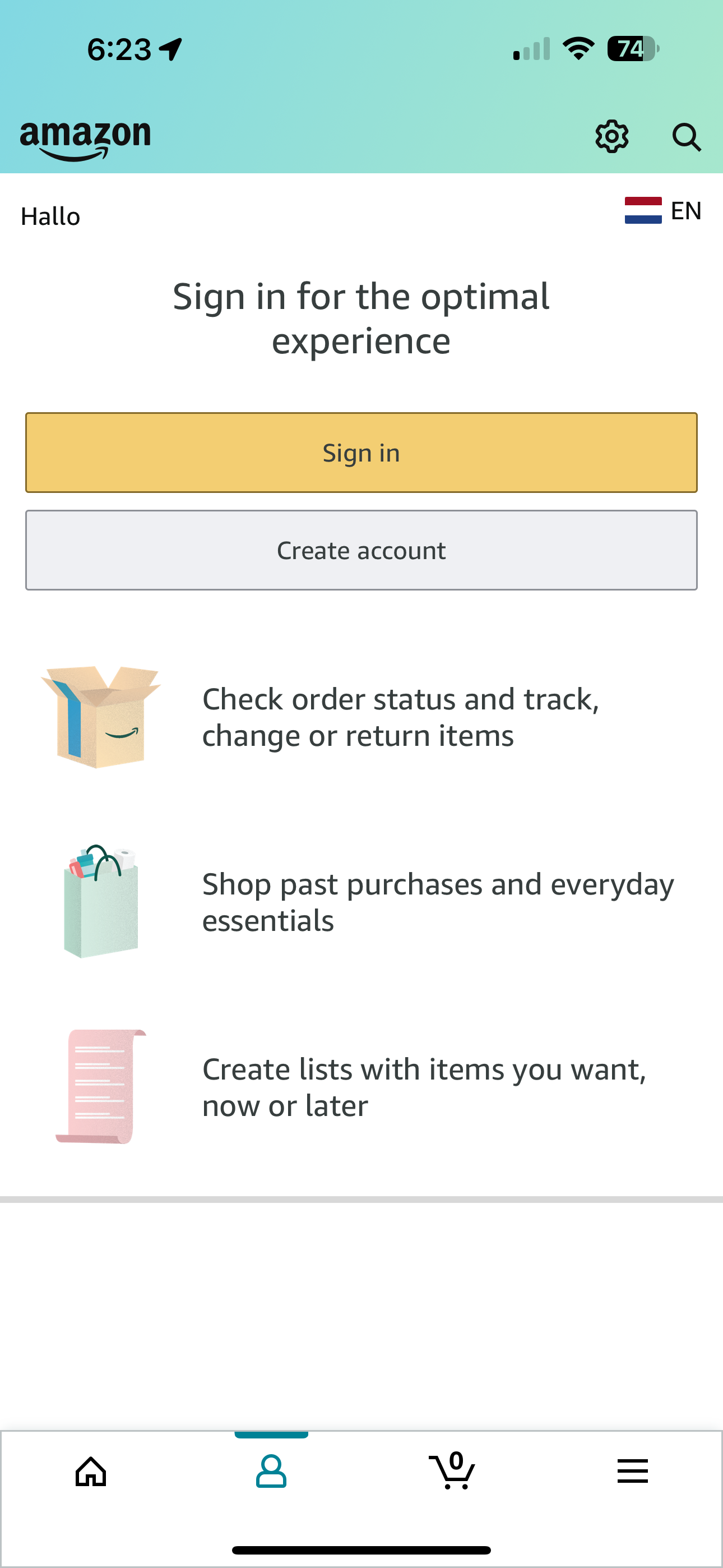
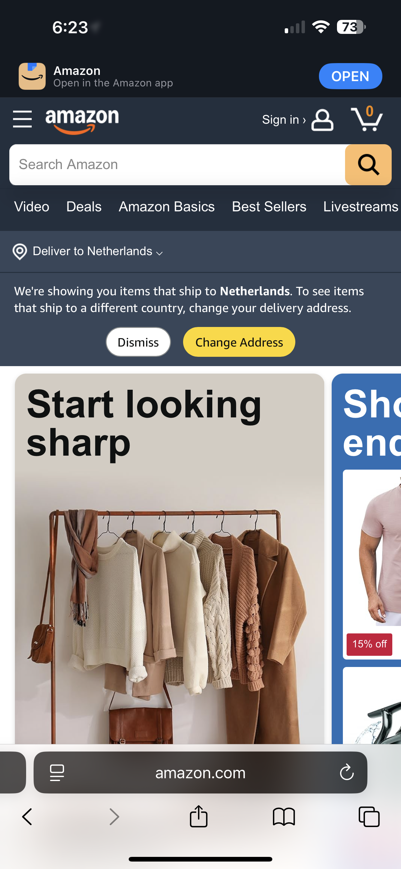
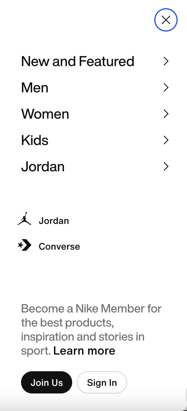
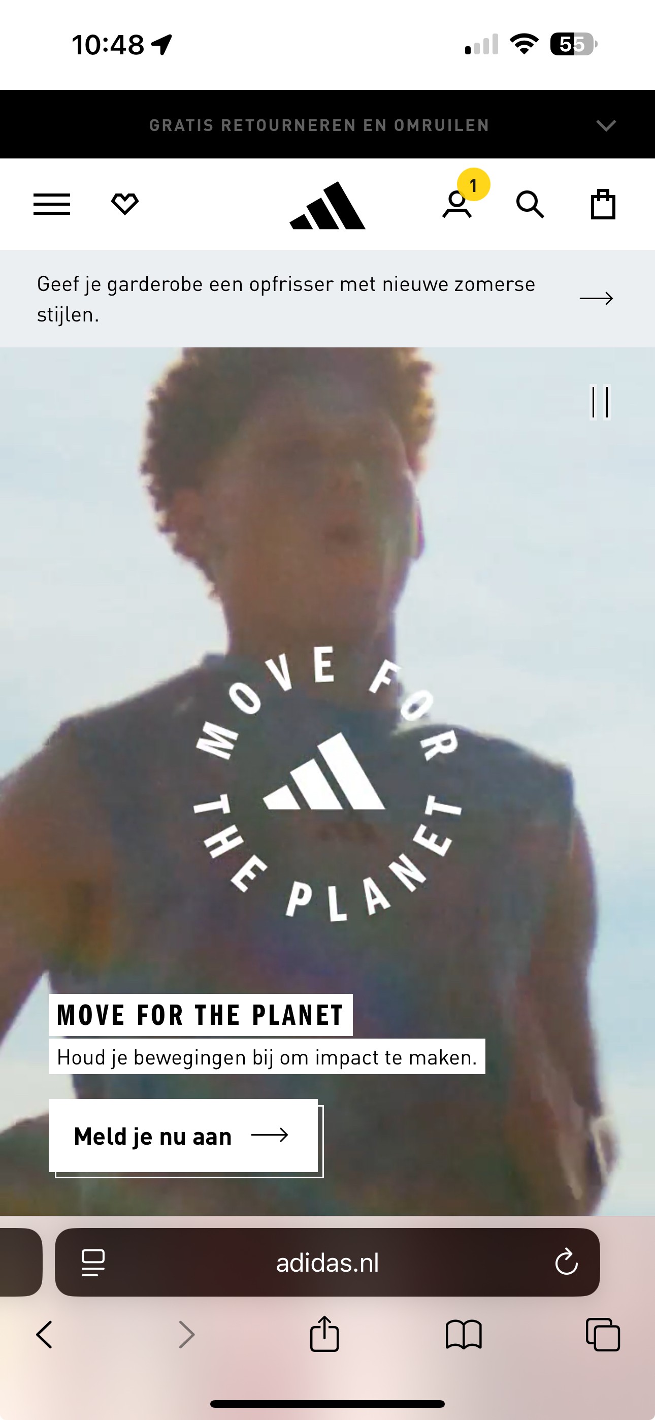
Industry leaders use a combination of strategies to incentivise logins. Some break down the login experience to reduce cognitive load, many show the benefits of logging in, and some add micro interactions to subliminally call attention to the account button. Copy-wise, they prioritise ‘sign in’ vs. “create account”.

03

Unmoderated test: users responded positively to the tooltip & account page redesign

  • 6 out of 7 users noticed the tooltip;
  • 5 out of 7 thought it was subtle, while 2 out of 7 found it distracting;
  • 5 out 7 felt compelled to click/tap it;
  • 4 out 7 users thought the benefits of logging in were clear and 3 out 7 had some questions/comments;

04

Users are motivated by tasks and incentives

From the 7 tests & strategies, we’ve learned that users require a task oriented motive (e.g. track their order) or incentive to login (e.g. discounts, benefits, etc).

Amazon app

Showcase benefits of logging in

Nice copy, emphasising experience

Amazon web

Small nudge to sign in, priority of signing in vs. creating account

Nike

Showcase benefits of logging in

Adidas

Micro interaction to nudge logins

DEFINE

Define key metrics

measure impact

01

Increase number of logins from account page

We wanted to gauge if the nudge affected login rates at the top of the funnel to further understand user behaviour and power personalisation.

02

No negative effect on conversion

Since we’re interrupting the browsing experience early on, we observed conversion to ensure there wasn’t a negative impact.

IDEATION

Sketches

initial ideation

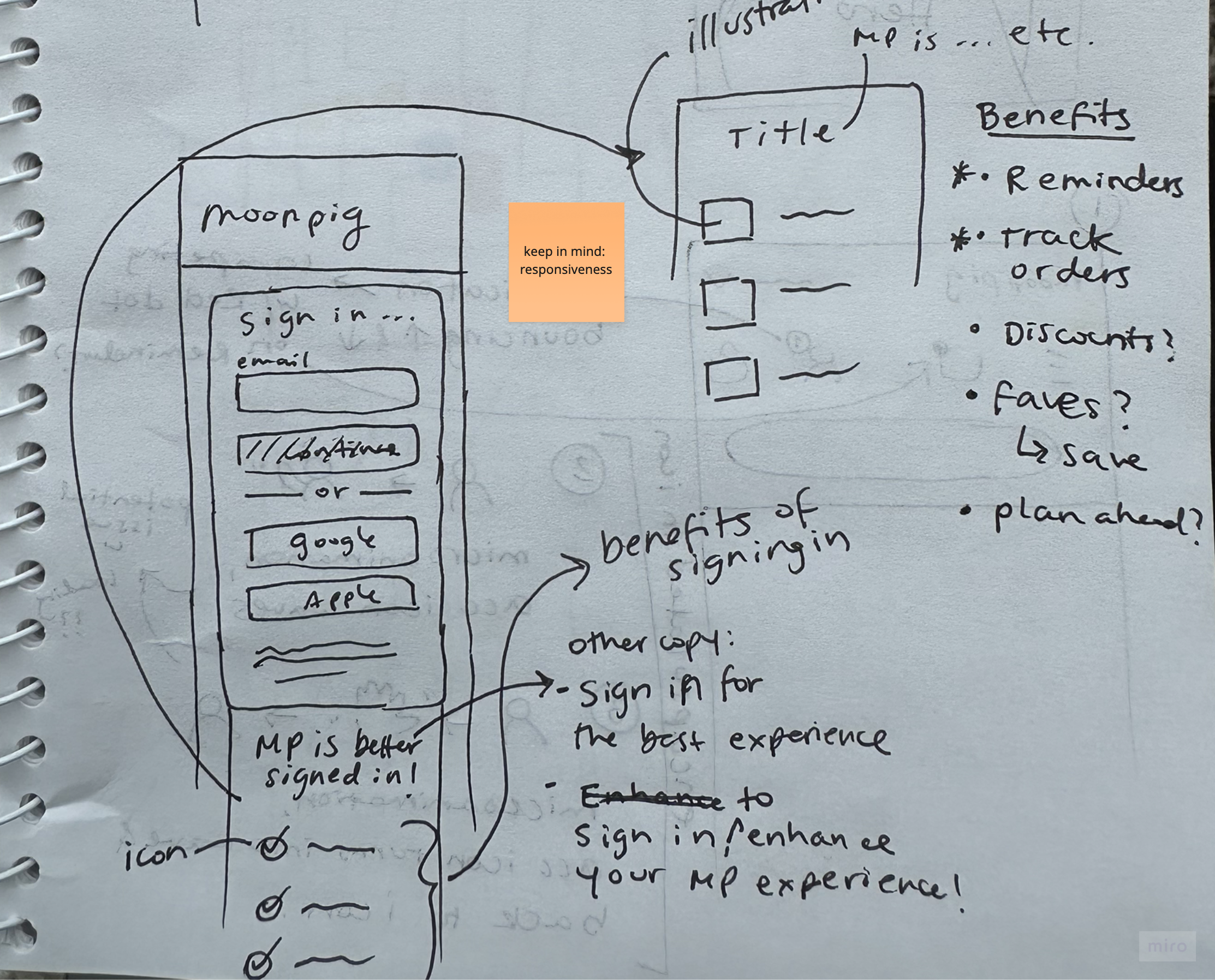
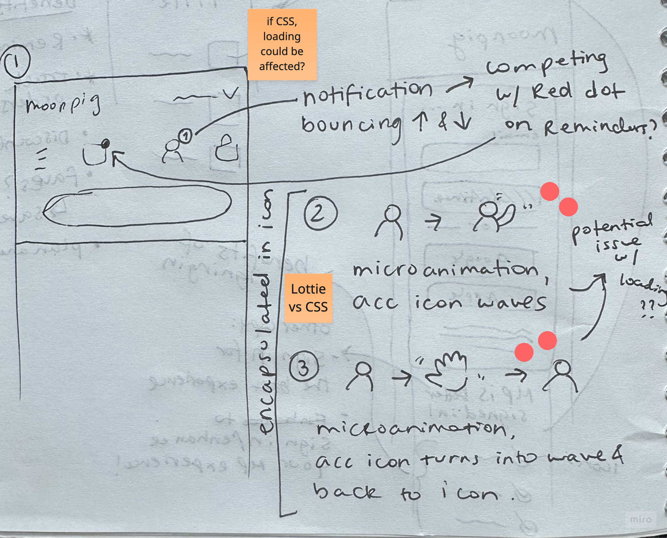
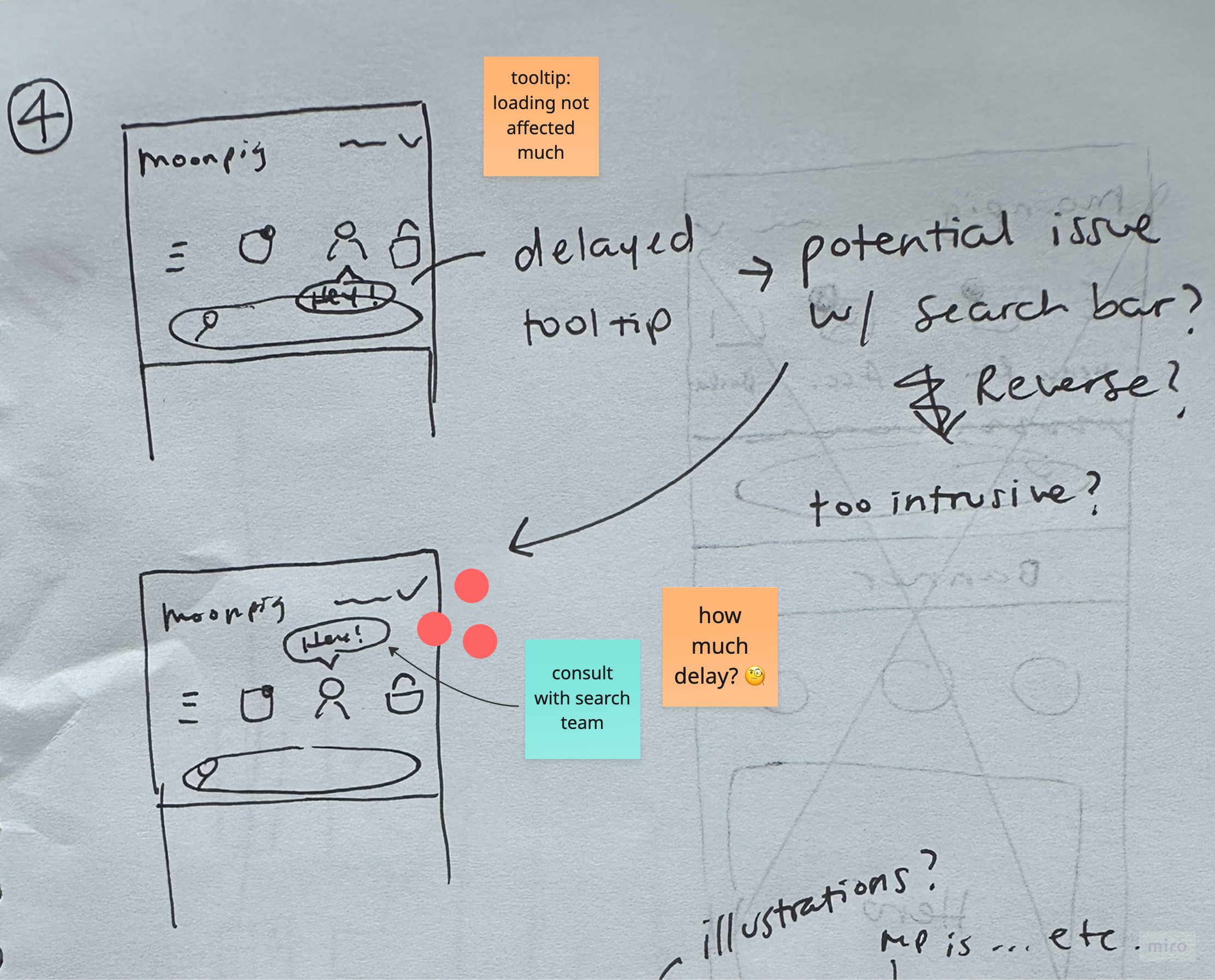
Ideated potential solutions to incentivise logins and redesigning the account page. Shared sketches with the PM, EM and 6 engineers, where they dot voted the top ideas based on feasibility and design.

TESTING & ITERATIONS

Usability testing

findings & iterations

User tested mobile prototypes with 7 users (mix of customers & non customers). I focused on testing clarity (especially the copy for the benefits), whether users noticed the tooltip, and its effectiveness.

Before

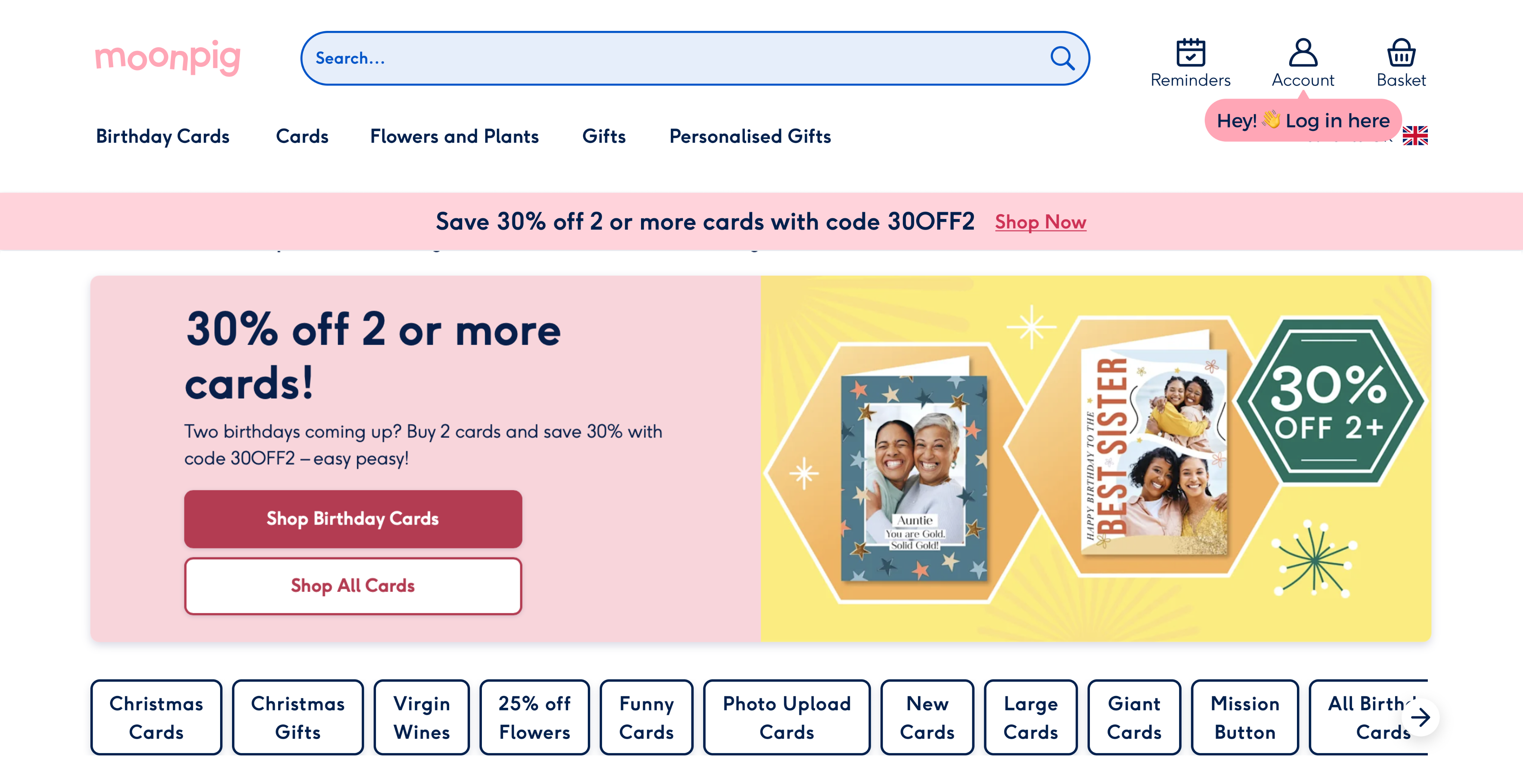
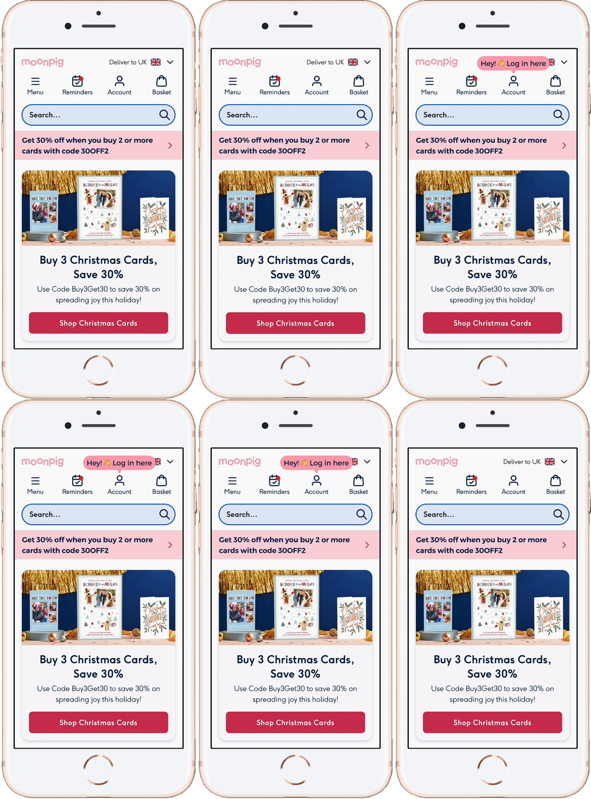
Most users noticed the tooltip, but some feedback suggested the tone felt too formal. The Search team flagged concerns about it overlapping the search bar. The timing of the delay also felt slightly off.

After

Refined the copy to be more approachable and added an emoji for warmth. Repositioned the tooltip above the icon to avoid obstructing search, and reduced the delay for a smoother experience.

Before

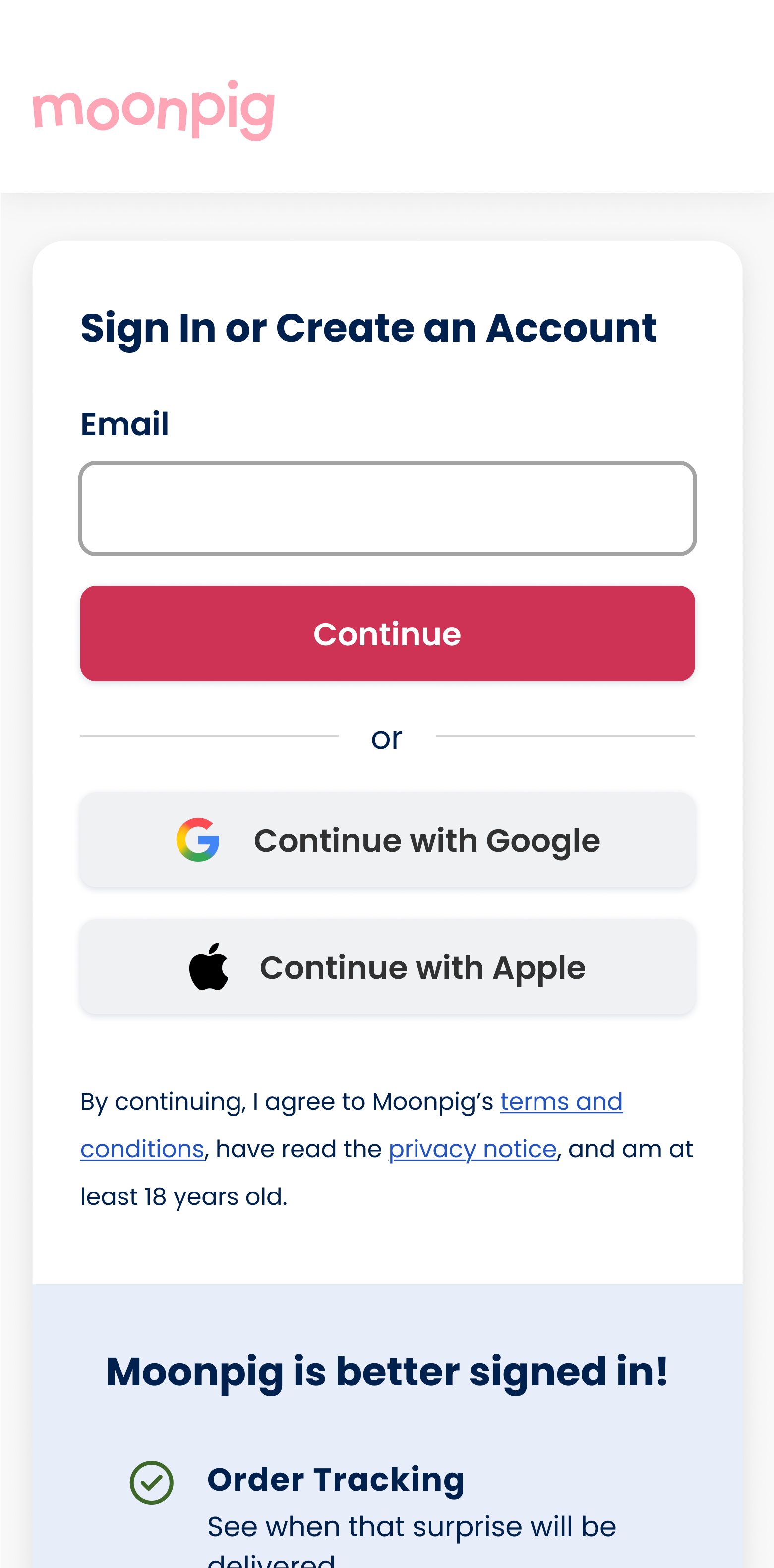
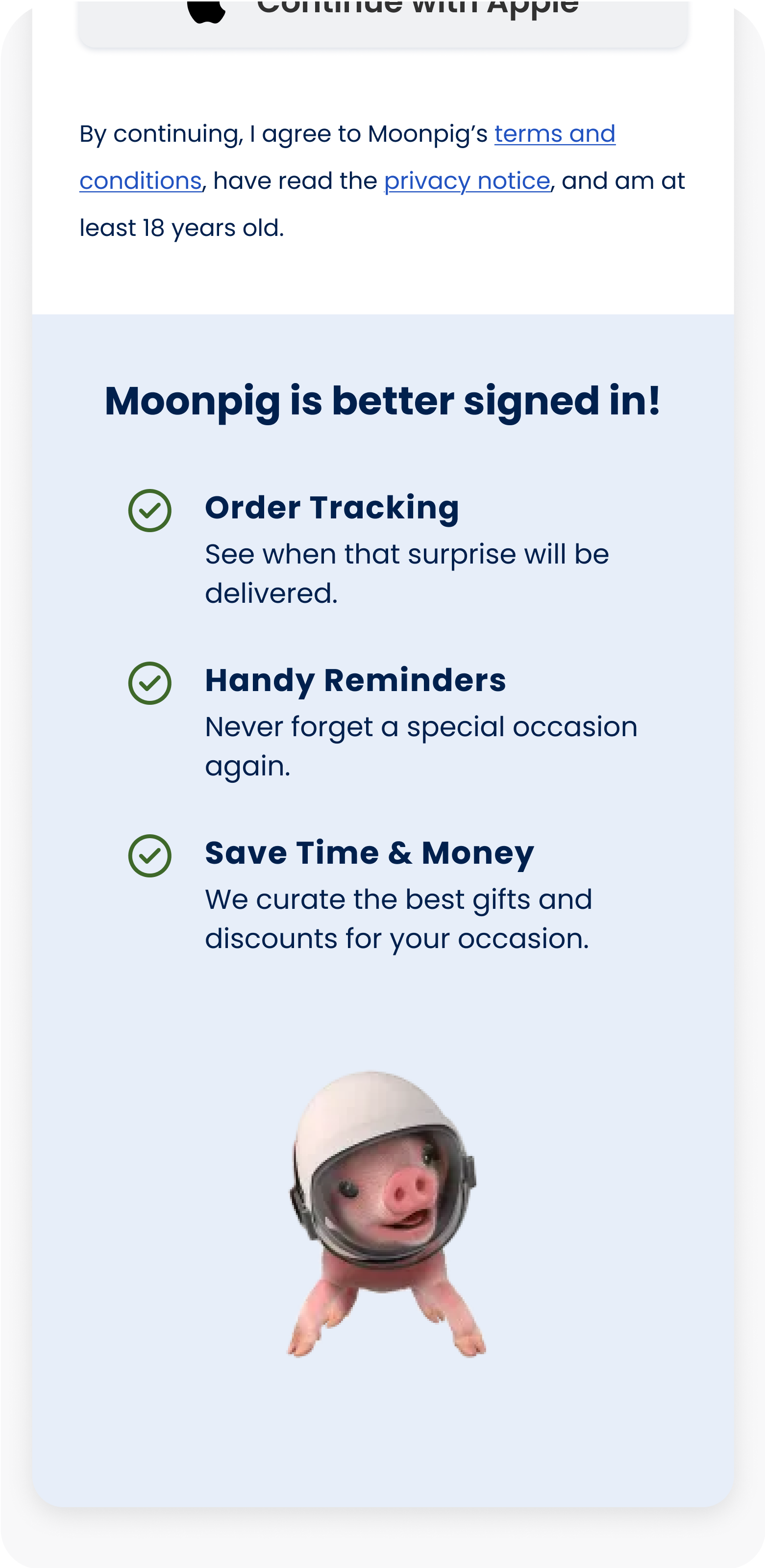
Users found "exclusive discounts" unclear, and we also felt it was misleading as we don’t offer true exclusivity for discounts. The header also felt too long, impacting readability.

After

Simplified copy for clarity and brand alignment. Revised benefit titles to better reflect current offerings and maintain consistency with Moonpig’s tone of voice.

FINAL DESIGN & RESULTS

Final designs

and A/B results

Due to the drop in conversion, we didn’t ship the tooltip. However, we did ship the account page re-design as it doesn’t disrupt user flow and users appreciated knowing the benefits of signing in.

Increase in logins top of funnel

5% increase of login rate from Mobile & Desktop homepage in the variant.

+5%

Login rate

Decrease in conversion

0.18% decrease in conversion in the variant. We hypothesise this could be due the tooltip interrupting users current flow.

-0.18%

Conversion

LEARNINGS

Reflecting on project

and outcomes

01

Flops still teach

I used to coach startups on how to fail fast. Turns out, it’s easier said than done. Although this isn’t the first project I led that ‘flopped’, it was the first time I felt confident to dig deeper into the why, and extract useful insights.

02

Involve devs ASAP

For this project, I decided to bring engineers in from day one. This allowed us to uncover tech constraints sooner and stay aligned throughout. Leading to a smoother handover and improved communication. 

03

History often repeats itself

In hindsight, as I looked into past strategies to increase logins at the top of the funnel, I had a gut feeling that introducing a nudge could potentially decrease conversion. The more I learn about the users and past strategies, the better my intuitive design decisions become.

Home

More to explore...

Menu iconography

0.4% increase in conversion

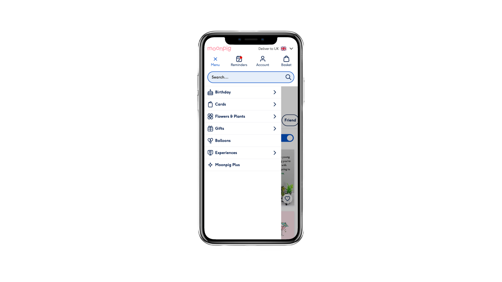
Created bespoke icons to improve mobile menu clarity and speed up navigation—resulting in a 0.44% uplift in conversion and 10% reduction in time to select menu category.

UI • Shipped • 2024

New feature visibility

1.4% increase in conversion

Introduced a new feature in the happy path to improve visibility and boost feature usage. Led to a 1.4% lift in conversion and 0.64% increase in group card project creations.

UX/UI • E2E • Shipped • 2024

Want to collaborate?

Let’s talk

Send an email

LinkedIn

Links

Work

About me

Design process

Download resume

Work

About me

Design process

Resume

DH

Nudge users to login to power personalisation

Login tooltip nudge

Encourage users to login at the top of the funnel to power personalisation.

At Moonpig, one of the biggest challenges users face is finding the perfect card or gift. We assume that personalisation can help by surfacing relevant content early in the journey.

However, around 70% of users who land on the homepage are logged out, limiting our ability to tailor their experience. I explored low-effort, high-impact ways to encourage users to log in.I designed a delayed ‘tooltip’ on the account icon to nudge users to sign in. While this led to an increase in logins, it also negatively impacted conversion, so we decided not to roll out the variant.Additionally, I revamped the account page to clearly communicate the benefits of logging in or creating an account; which was successfully implemented.

Problem

Users struggle to find the perfect card or gift. With ~70% of homepage visitors logged out, Moonpig is limited in its ability to personalise content to enhance the browsing experience.

Outcome

The tooltip led to a modest increase in login rates, but negatively impacted conversion, leading to the decision to not roll out the variant. However, the account page redesign was implemented.

Timeline

Feb — Mar 2024

Role

Product Designer

Team

1 midweight designer (me), 1 product manager, team of developers

Tools

Figma

Miro

Google Analytics

Usertesting.com

Hotjar

JIRA

Slack

Google suite

DISCOVER

User research

process & plan

Conducted several forms of research to understand the current space and identify opportunities. With my team, we also assessed previous strategies to boost login rates.

01

Hotjar observations

01

Observed 30 recordings of users that land on the homepage and click/tap on the account button.

02

Competitor analysis

01

Analysed 6 industry leaders—Adidas, Nike, IKEA, Booking.com, Amazon, and Airbnb—to explore login strategies.

03

7 unmoderated usertests

01

Conducted 7 unmoderated usertests with Moonpig customers & non-customers to evaluate the effectiveness and subtly of the delayed tooltip on the homepage. Additionally, assessed the usability and clarity of the redesigned account page.

04

Historical strategies analysis

01

Reviewed previous A/B tests and design efforts geared to increase logins to understand past successes and failures.

User research

results & insights

01

Hotjar: 84% of users login to track or view past orders

Of the 30 users observed in Hotjar:

  • 84% logged in to view previous purchases or track orders
  • 15% attempted to log in, but couldn't recall their password
  • 1% logged in to access occasion reminders

02

Comp analysis: industry leaders use a mix of nudges & showcasing benefits of logging in

Industry leaders use a combination of strategies to incentivise logins. Some break down the login experience to reduce cognitive load, many show the benefits of logging in, and some add micro interactions to subliminally call attention to the account button. Copy-wise, they prioritise ‘sign in’ vs. “create account”.

03

Unmoderated test: users responded positively to the tooltip & account page redesign

  • 6 out of 7 users noticed the tooltip;
  • 5 out of 7 thought it was subtle, while 2 out of 7 found it distracting;
  • 5 out 7 felt compelled to click/tap it;
  • 4 out 7 users thought the benefits of logging in were clear and 3 out 7 had some questions/comments;

04

Users are motivated by tasks and incentives

From the 7 tests & strategies, we’ve learned that users require a task oriented motive (e.g. track their order) or incentive to login (e.g. discounts, benefits, etc).

Amazon app

Showcase benefits of logging in

Nice copy, emphasising experience

Amazon web

Small nudge to sign in, priority of signing in vs. creating account

Nike

Showcase benefits of logging in

Adidas

Micro interaction to nudge logins

DEFINE

Define key metrics

measure impact

01

Increase number of logins from account page

We wanted to gauge if the nudge affected login rates at the top of the funnel to further understand user behaviour and power personalisation.

02

No negative effect on conversion

Since we’re interrupting the browsing experience early on, we observed conversion to ensure there wasn’t a negative impact.

IDEATION

Sketches

initial ideation

Ideated potential solutions to incentivise logins and redesigning the account page. Shared sketches with the PM, EM and 6 engineers, where they dot voted the top ideas based on feasibility and design.

TESTING & ITERATIONS

Usability testing

findings & iterations

User tested mobile prototypes with 7 users (mix of customers & non customers). I focused on testing clarity (especially the copy for the benefits), whether users noticed the tooltip, and its effectiveness.

Before

Most users noticed the tooltip, but some feedback suggested the tone felt too formal. The Search team flagged concerns about it overlapping the search bar. The timing of the delay also felt slightly off.

After

Refined the copy to be more approachable and added an emoji for warmth. Repositioned the tooltip above the icon to avoid obstructing search, and reduced the delay for a smoother experience.

Before

Users found "exclusive discounts" unclear, and we also felt it was misleading as we don’t offer true exclusivity for discounts. The header also felt too long, impacting readability.

After

Simplified copy for clarity and brand alignment. Revised benefit titles to better reflect current offerings and maintain consistency with Moonpig’s tone of voice.

FINAL DESIGN & RESULTS

Final designs

and A/B results

Due to the drop in conversion, we didn’t ship the tooltip. However, we did ship the account page re-design as it doesn’t disrupt user flow and users appreciated knowing the benefits of signing in.

Increase in logins top of funnel

5% increase of login rate from Mobile & Desktop homepage in the variant.

+5%

Login rate

Decrease in conversion

0.18% decrease in conversion in the variant. We hypothesise this could be due the tooltip interrupting users current flow.

-0.18%

Conversion

LEARNINGS

Reflecting on project

and outcomes

01

Flops still teach

I used to coach startups on how to fail fast. Turns out, it’s easier said than done. Although this isn’t the first project I led that ‘flopped’, it was the first time I felt confident to dig deeper into the why, and extract useful insights.

02

Involve devs ASAP

For this project, I decided to bring engineers in from day one. This allowed us to uncover tech constraints sooner and stay aligned throughout. Leading to a smoother handover and improved communication. 

03

History often repeats itself

In hindsight, as I looked into past strategies to increase logins at the top of the funnel, I had a gut feeling that introducing a nudge could potentially decrease conversion. The more I learn about the users and past strategies, the better my intuitive design decisions become.

Home

More to explore...

New feature visibility

1.4% increase in conversion

Introduced a new feature in the happy path to improve visibility and boost feature usage. Led to a 1.4% lift in conversion and 0.64% increase in group card project creations.

UX/UI • E2E • Shipped • 2024

Menu iconography

0.4% increase in conversion

Created bespoke icons to improve mobile menu clarity and speed up navigation—resulting in a 0.44% uplift in conversion and 10% reduction in time to select menu category.

UI • Shipped • 2024

Want to collaborate?

Let’s talk

Send an email

LinkedIn

Links

Work

About me

Design process

Download resume

D

H

Work

About me

Design process

Resume

Nudge users to login to power personalisation
Login tooltip nudge

Encourage users to login at the top of the funnel to power personalisation.

At Moonpig, one of the biggest challenges users face is finding the perfect card or gift. We assume that personalisation can help by surfacing relevant content early in the journey.

However, around 70% of users who land on the homepage are logged out, limiting our ability to tailor their experience. I explored low-effort, high-impact ways to encourage users to log in.I designed a delayed ‘tooltip’ on the account icon to nudge users to sign in. While this led to an increase in logins, it also negatively impacted conversion, so we decided not to roll out the variant.Additionally, I revamped the account page to clearly communicate the benefits of logging in or creating an account; which was successfully implemented.

Problem

Group cards is one of Moonpig’s most exciting features, yet it accounts for 0.2% of total orders. Users struggle to discover it organically, highlighting a clear visibility issue in the core journey.

Outcome

The tooltip led to a modest increase in login rates, but negatively impacted conversion, leading to the decision to not roll out the variant. However, the account page redesign was implemented.

Role

Product Designer

Timeline

Feb — Mar 2024

Team

1 midweight designer (me), 1 product manager, team of developers

Tools

Figma

Miro

Google Analytics

Usertesting.com

Hotjar

JIRA

Slack

Google suite

DISCOVER

User research

process & plan

Conducted several forms of research to understand the current space and identify opportunities. With my team, we also assessed previous strategies to boost login rates.

01

Hotjar observations

01

Observed 30 recordings of users that land on the homepage and click/tap on the account button.

02

Competitor analysis

01

Analysed 6 industry leaders—Adidas, Nike, IKEA, Booking.com, Amazon, and Airbnb—to explore login strategies.

03

7 unmoderated usertests

01

Conducted 7 unmoderated usertests with Moonpig customers & non-customers to evaluate the effectiveness and subtly of the delayed tooltip on the homepage. Additionally, assessed the usability and clarity of the redesigned account page.

04

Historical strategies analysis

01

Reviewed previous A/B tests and design efforts geared to increase logins to understand past successes and failures.

User research

results & insights

01

Hotjar: 84% of users login to track or view past orders

Of the 30 users observed in Hotjar:

  • 84% logged in to view previous purchases or track orders
  • 15% attempted to log in, but couldn't recall their password
  • 1% logged in to access occasion reminders

02

Comp analysis: industry leaders use a mix of nudges & showcasing benefits of logging in

Industry leaders use a combination of strategies to incentivise logins. Some break down the login experience to reduce cognitive load, many show the benefits of logging in, and some add micro interactions to subliminally call attention to the account button. Copy-wise, they prioritise ‘sign in’ vs. “create account”.

03

Unmoderated test: users responded positively to the tooltip & account page redesign

  • 6 out of 7 users noticed the tooltip;
  • 5 out of 7 thought it was subtle, while 2 out of 7 found it distracting;
  • 5 out 7 felt compelled to click/tap it;
  • 4 out 7 users thought the benefits of logging in were clear and 3 out 7 had some questions/comments;

04

Users are motivated by tasks and incentives

From the 7 tests & strategies, we’ve learned that users require a task oriented motive (e.g. track their order) or incentive to login (e.g. discounts, benefits, etc).

Amazon app

Showcase benefits of logging in

Nice copy, emphasising experience

Amazon web

Small nudge to sign in, priority of signing in vs. creating account

Nike

Showcase benefits of logging in

Adidas

Micro interaction to nudge logins

DEFINE

Define key metrics

measure impact

01

Increase number of logins from account page

We wanted to gauge if the nudge affected login rates at the top of the funnel to further understand user behaviour and power personalisation.

02

No negative effect on conversion

Since we’re interrupting the browsing experience early on, we observed conversion to ensure there wasn’t a negative impact.

IDEATION

Sketches

initial ideation

Ideated potential solutions to incentivise logins and redesigning the account page. Shared sketches with the PM, EM and 6 engineers, where they dot voted the top ideas based on feasibility and design.

TESTING & ITERATIONS

Usability testing

findings & iterations

User tested mobile prototypes with 7 users (mix of customers & non customers). I focused on testing clarity (especially the copy for the benefits), whether users noticed the tooltip, and its effectiveness.

Before

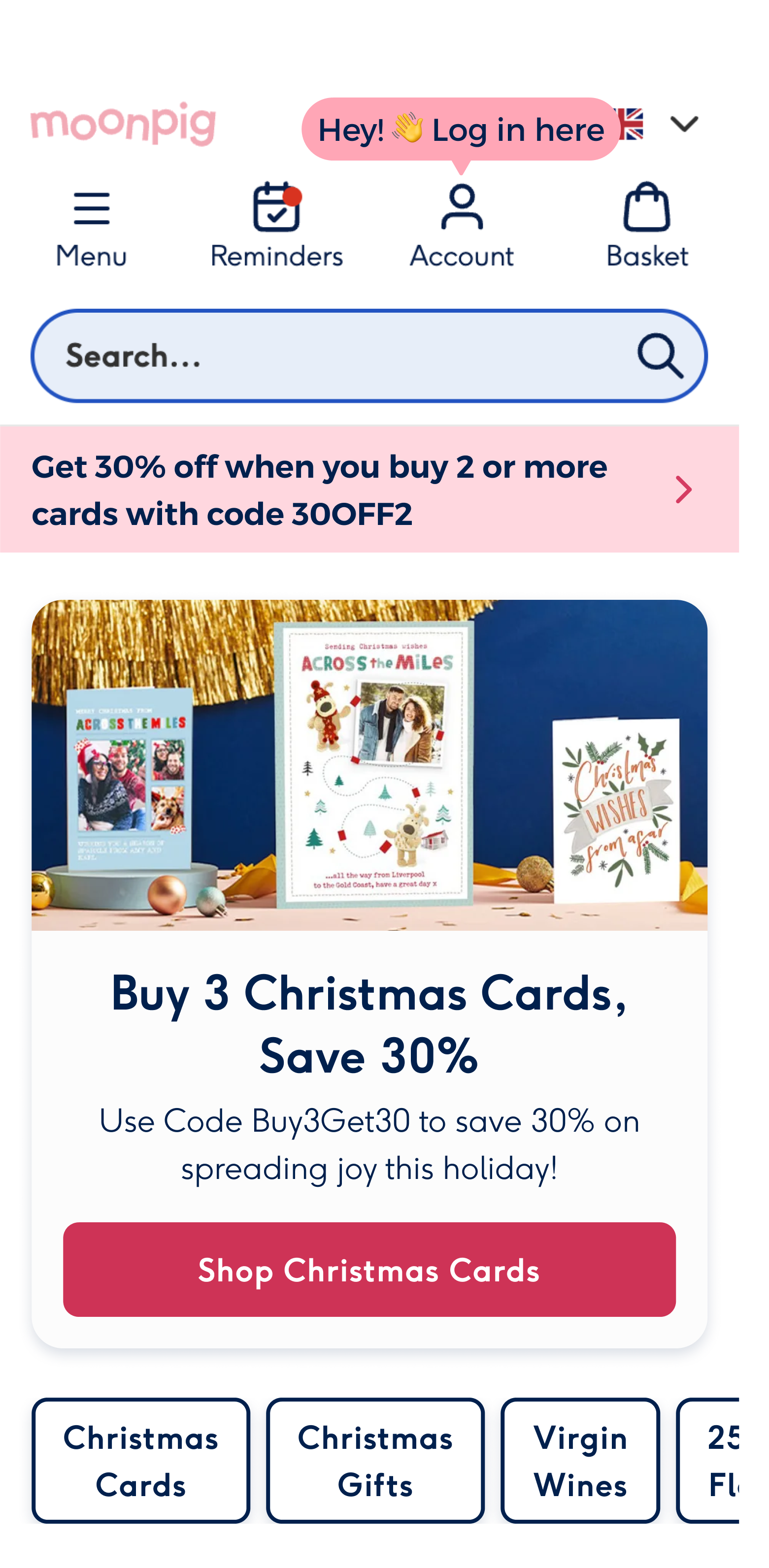
Most users noticed the tooltip, but some feedback suggested the tone felt too formal. The Search team flagged concerns about it overlapping the search bar. The timing of the delay also felt slightly off.
After

Refined the copy to be more approachable and added an emoji for warmth. Repositioned the tooltip above the icon to avoid obstructing search, and reduced the delay for a smoother experience.

Before

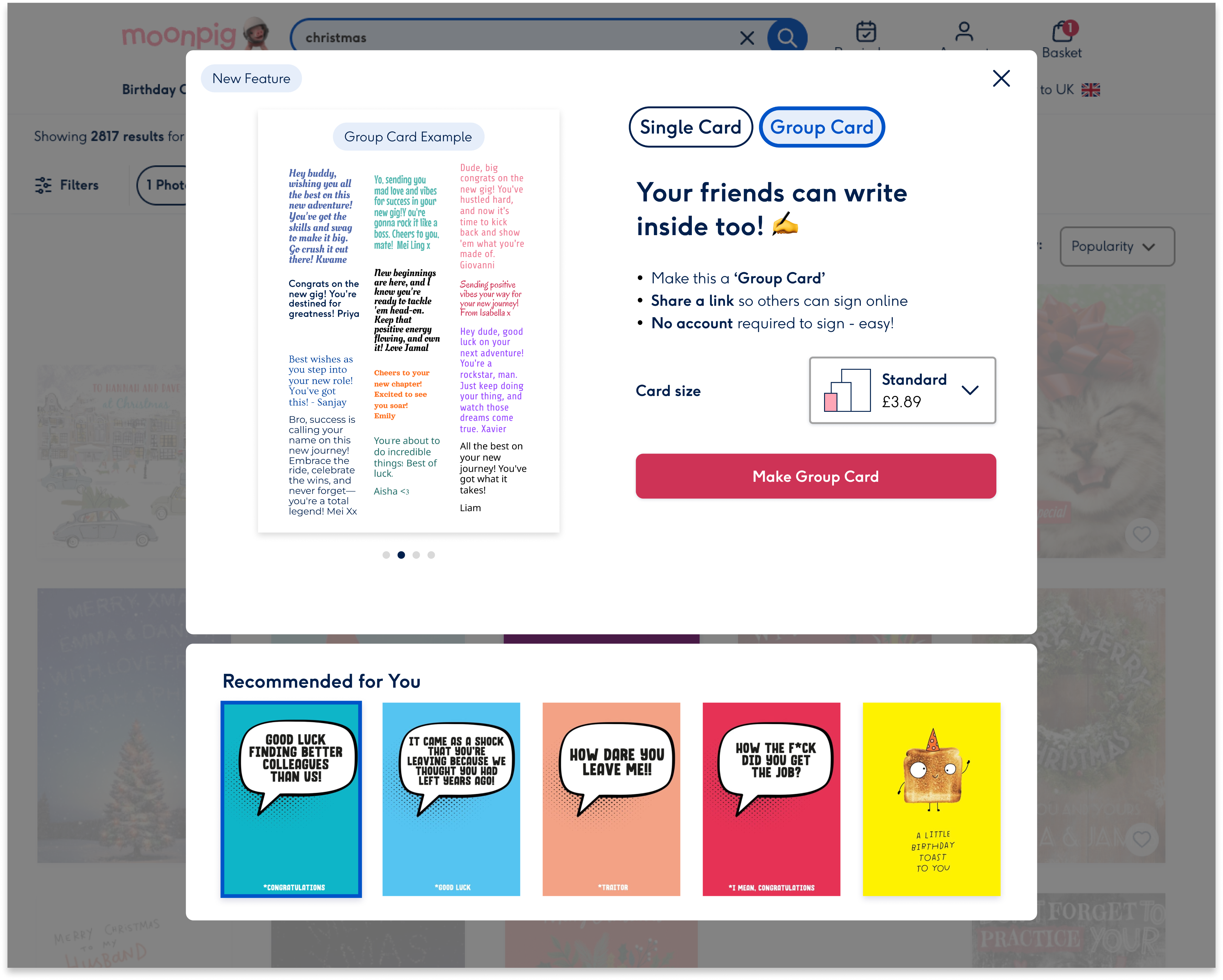
Users found "exclusive discounts" unclear, and we also felt it was misleading as we don’t offer true exclusivity for discounts. The header also felt too long, impacting readability.

After

Simplified copy for clarity and brand alignment. Revised benefit titles to better reflect current offerings and maintain consistency with Moonpig’s tone of voice.
FINAL DESIGN & RESULTS

Final designs

and A/B results

Due to the drop in conversion, we didn’t ship the tooltip. However, we did ship the account page re-design as it doesn’t disrupt user flow and users appreciated knowing the benefits of signing in.

Increase in logins top of funnel

5% increase of login rate from Mobile & Desktop homepage in the variant.

+5%

Login rate

Decrease in conversion

0.18% decrease in conversion in the variant. We hypothesise this could be due the tooltip interrupting users current flow.

-0.18%

Conversion

LEARNINGS

Reflecting on project

and outcomes

01

Flops still teach

I used to coach startups on how to fail fast. Turns out, it’s easier said than done. Although this isn’t the first project I led that ‘flopped’, it was the first time I felt confident to dig deeper into the why, and extract useful insights.

02

Involve devs ASAP

For this project, I decided to bring engineers in from day one. This allowed us to uncover tech constraints sooner and stay aligned throughout. Leading to a smoother handover and improved communication. 

03

History often repeats itself

In hindsight, as I looked into past strategies to increase logins at the top of the funnel, I had a gut feeling that introducing a nudge could potentially decrease conversion. The more I learn about the users and past strategies, the better my intuitive design decisions become.

Home

More to explore...

New feature visibility

1.4% increase in conversion

Introduced a new feature in the happy path to improve visibility and boost feature usage. Led to a 1.4% lift in conversion and 0.64% increase in group card project creations.

UX/UI • E2E • Shipped • 2024

Menu iconography

0.4% increase in conversion
Created bespoke icons to improve mobile menu clarity and speed up navigation—resulting in a 0.44% uplift in conversion and 10% reduction in time to select menu category.

UI • Shipped • 2024

Want to collaborate?

Let’s talk

Send an email

LinkedIn

Links

Work

About me

Design process

Download resume